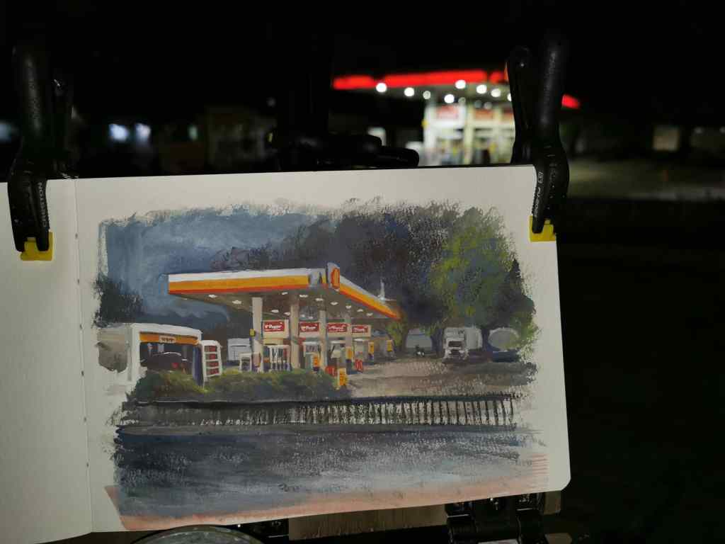
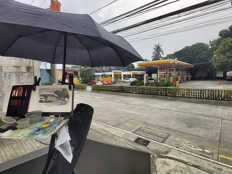
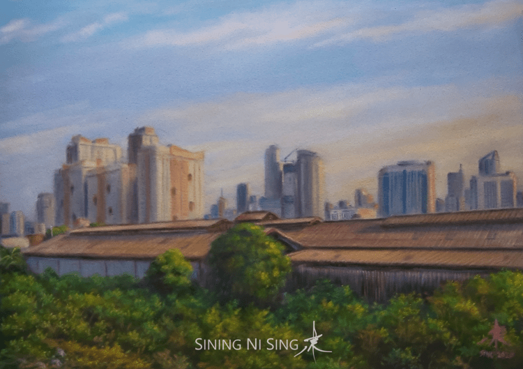
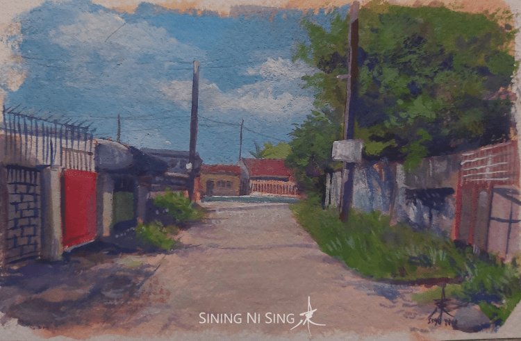
It was a Saturday with a gray, overcast sky and 50% chance of rain. I went out a few minutes before 2:00 PM, and tried to look for a subject in our neighborhood. A Shell gas station caught my attention. I knew painting it would be hard. Too many details, values seemed hard to figure out, plus the perspective. I took the risk and thought maybe I should give it a try.
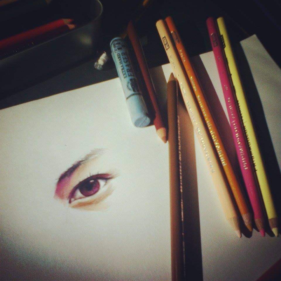
I used casein (cadmium red pale, cadmium yellow light, ultramarine blue deep, and titanium white) on an A5 sketchbook. I started by sketching the subject with a water-soluble colored pencil. It took me a while to measure the objects and get the perspective correctly.
Just as I was about to block in the colors, it started to rain. Good thing I brought an umbrella and extra spring clamps. I was able to attach it to my tripod and both my hands were free again.
I used transparent washes first, as it really helped in getting the texture of the concrete. I used opaque colors as I tried to fill in the big shapes and details.
The spring clamps held my umbrella in place.
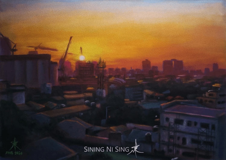
I was planning to finish it in two hours, but it seemed too difficult for me. Three hours after I started, I was only halfway through and it was getting dark. I did not have the luxury of coming back for another day. Then the station’s lights turned on. The values and the shadows changed dramatically. I thought it was pointless to continue, maybe I should just go home and copy from a reference photo I took earlier. My legs and feet were painful too.
That fateful moment. I almost threw in the towel at this point.
But I chose to continue and finish it on location.
I used my phone as a flashlight so I could see what I was doing. The rain started to fall again, but thankfully it was only light and quick. I worked on the painting for an another hour. I painted over the gray sky with dark blue and made the posts and pumps warmer to make them stand out. I painted the rails in the middle of the road as well as part of the pavement in the foreground using alternating opaque and transparent layers. I tried to add the power lines using a water-soluble colored pencil in the end. The pencils don’t work as well as they do in gouache and watercolor, so I used water-soluble wax pastels (Neocolor 2) instead. I also tried to use the spotlight effect in one of the pumps.
Almost done.
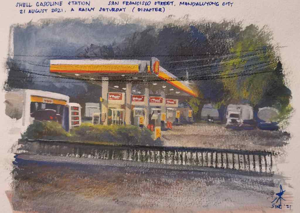
I finished the painting after five hours, at exactly 7:00 PM. It was not as I good as I wanted it to be, but I was quite happy that I was able to finish it. Good thing I persisted and chose not to quit. The casein’s properties also helped, as the painting did not look too dark.
The final painting
Shell Gas Station Casein on sketchbook 5 in. × 8 in. Painted on location 2021
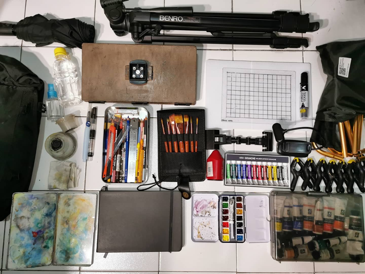
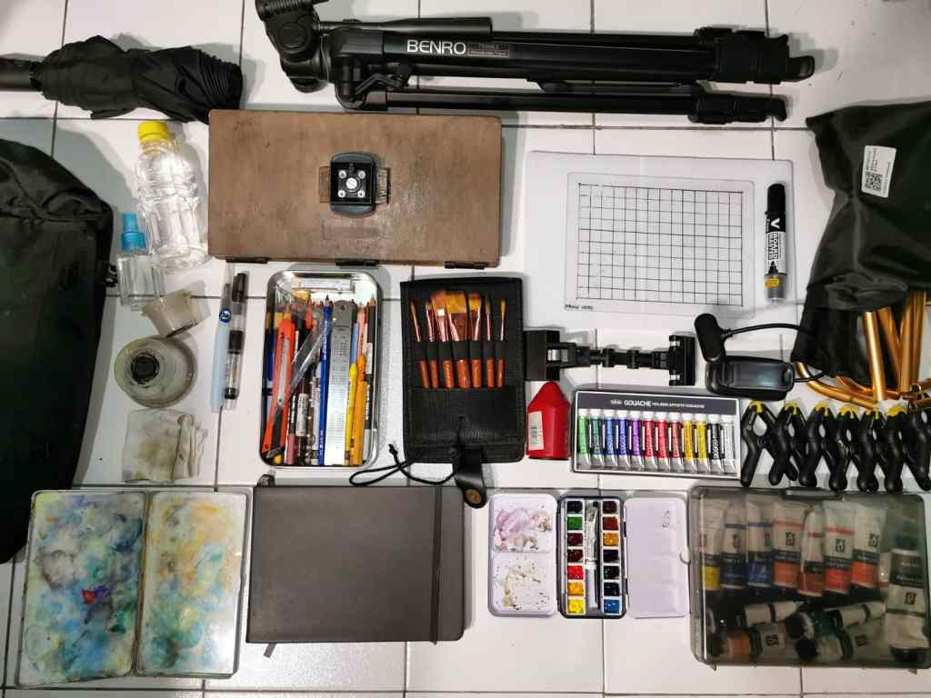
I am a huge fan of James Gurney. His lessons and videos changed how I paint dramatically. His videos reintroduced me to gouache and watercolor and made me fall in love with casein, my current favorite plein air medium. Since I learned about him last year, I got hold of his book Color and Light as well as several of his Gumroad tutorials to learn more. I also tried to invest on the same materials that he has, including his homemade easel. I always loved painting in other locations, and I thought it wou0ld be awesome if I could have a similar kit. Indeed imitation is the highest form of flattery.
The contents of my kit.
It took me more than a year to get hold of most of the stuff he uses. The torque hinges and casein paint that he uses were not available here, so I had to buy from Amazon and other international sellers. I had to ask for help from local hardware and even upholstery shops as I did not have the tools to build his easel. I had to test the kit for quite a few times on actual plein air sessions to determine its strengths and waeknesses, as I wanted to build one that offers great flexibility and adaptability. After painting under the intense summer heat, a thunderstorm, in the sidewalk, and in the dark while trying out different media, I was finally able to determine and put together what seemed to work best.
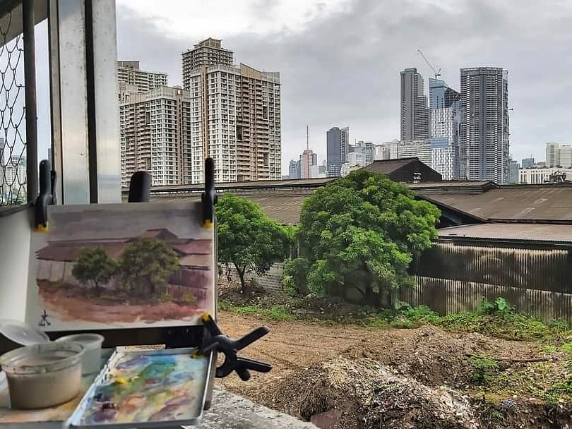
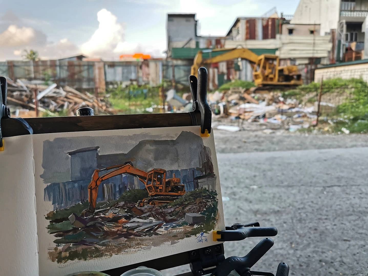
Painting on a rainy day with caseinPainting a gas station on a rainy day. This took five hours and deserves its own blog post.Painting an excavator on location with casein. The easel here is a prototype made from an unused wooden painting palette. The one I have on my kit now is made of thicker marine plywood and has more torque hinges.
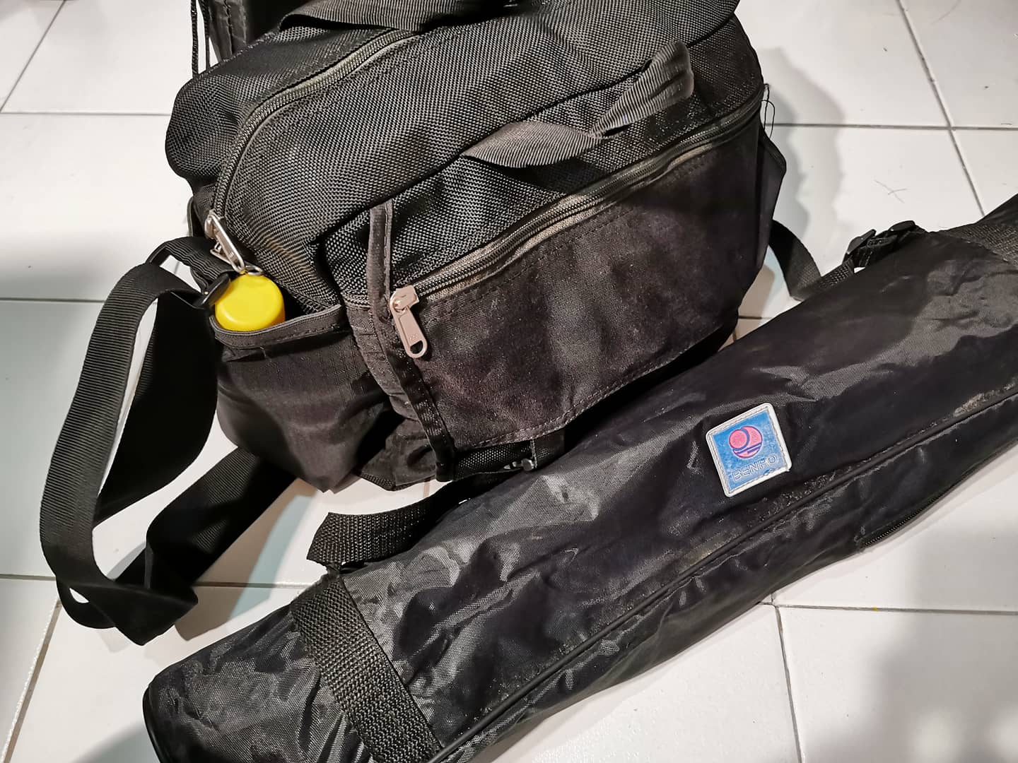
This outdoor painting kit draws inspiration from his YouTube and Gumroad videos. Usually outdoor painting requires planning, and thus one can decide on what to bring. This kit however allows me to leave even without a solid plan or adapt to certain scenarios while on location, like the sudden need to change the medium, rain, or absence of adequate lighting. All except the tripod can fit on a single bag.
It contains the following:
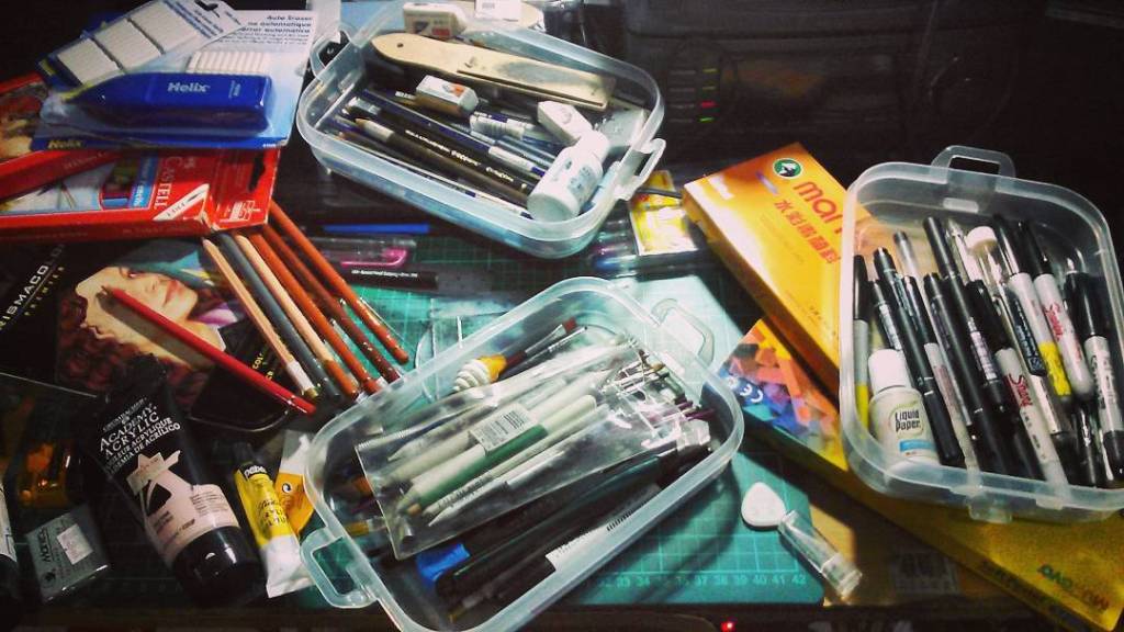
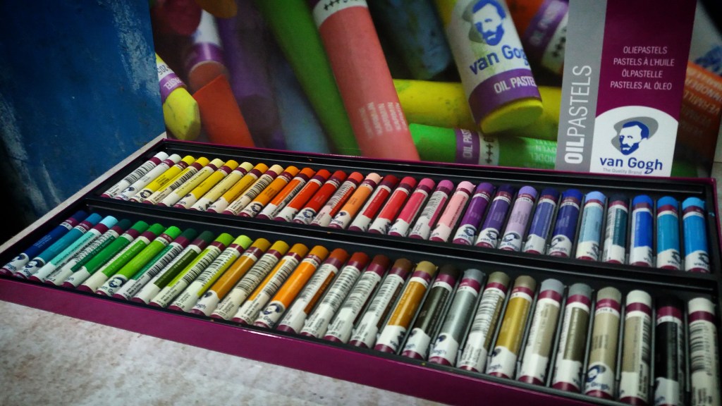
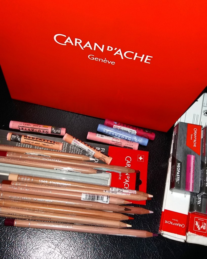
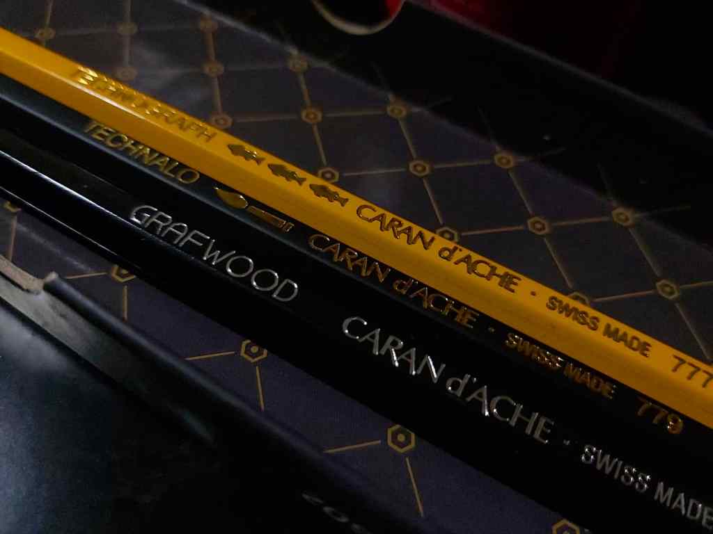
Heavy duty tripod Messenger bag Recycled water bottle Misting / spray bottle Water cups (recycled sauce cups) with magnets Cloth rag Photo holder clip (for the diffuser and grid) Spring clamps Recycled metal palette Dry erase marker Portable stool Pencil sharpener Travel brush set Sighting grid White corrugated plastic sheet (diffuser) James Gurney style easel Watercolor sketchbook (Etchr Lab) Repurposed metal box Different pens with brown and blue ink Water brushes Cutter Small triangle and ruler Kneadable and latex-free erasers Graphite pencil (Caran d’Ache) Water-solluble colored pencils (Caran d’Ache Supracolor 2 and Museum Aquarelle) Water solluble pastels (Caran d’Ache Neocolor 2) Dry pastel sticks (Faber Castell Polychromos, Caran d’Ache) Small gouache set (Holbein) Watercolor tin with brush and opaque white (Holbein) Casein paint tubes (Jack Richeson Shiva) Umbrella Rechargeable clip light
I made a video of this kit a week ago, before I added the clip light. You may watch it here: https://youtu.be/vZDSX3QMZz0
Perhaps the quest to keep refining the kit will continue as I go on with more plein air sessions. But one thing will remain – James Gurney’s influence and legacy that I will always be thankful for.
The medium that literally feels like home. I will never get tired of the familiar sticky feeling in the hands, the strong smell that I love probably next to wax crayons. This medium that I used merely for coloring as a child has become one of the strongest in my arsenal.
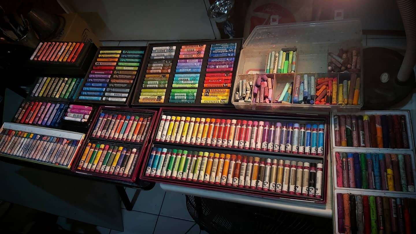
I have used several oil pastel brands throughout the years. I have learned to generally look at three core characteristics in choosing what brand will I use:
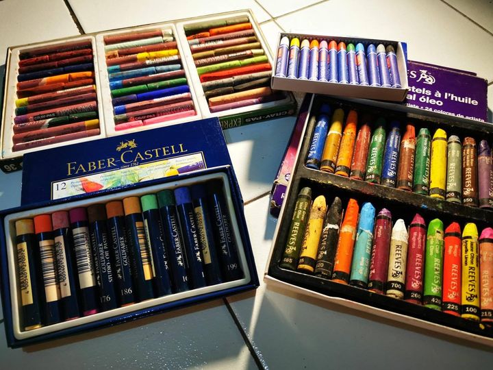
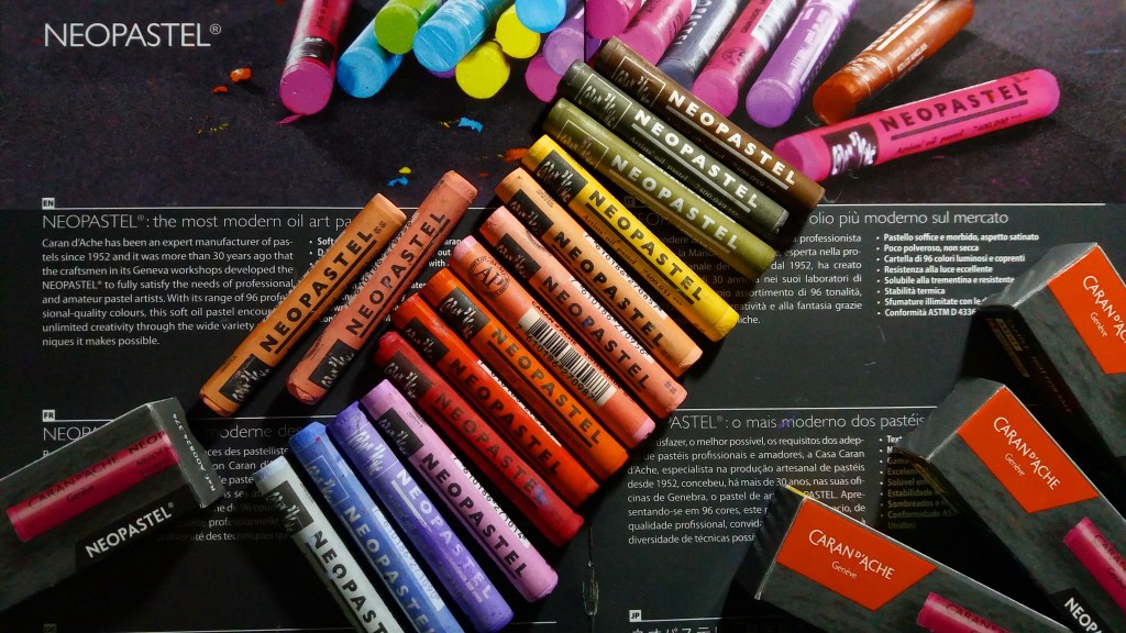
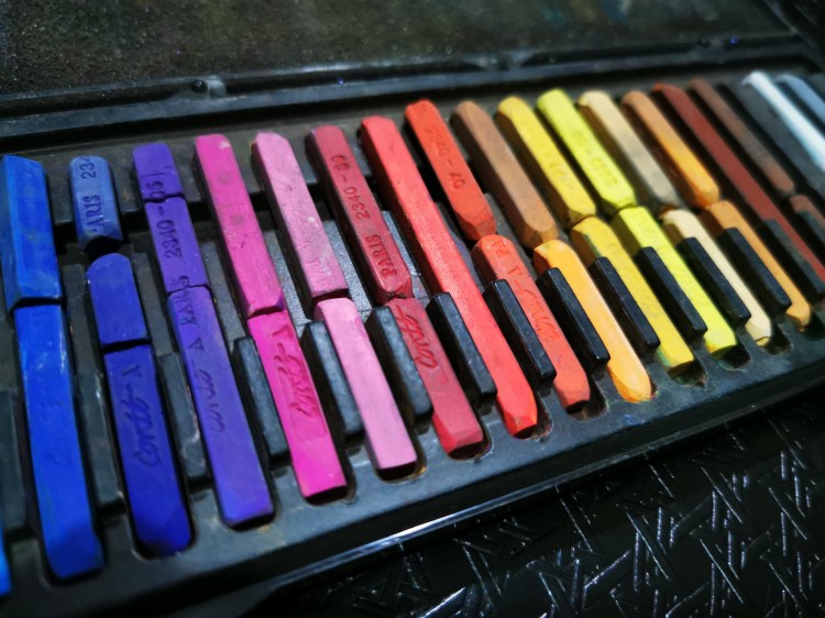
All the oil pastel brands That I have tried. From left to right: Golden, Pentel, Dong A, Reeves, Faber Castell, Sakura Cray-pas Expressionist, Mungyo Gallery, Maimeri Classico, Holbein Academic, Royal Talens Van Gogh, Mungyo Gallery Soft, Caran d’Ache Neopastel, Sennelier.
Softness – oil pastels can be hard and soft, depending on the brand. The variations in softness can be helpful. For instance, hard oil pastels can be good for blocking in and creating bold strokes while the softer ones can be used for top layers. Sennelier is the softest brand I have tried, followed by Caran d’Ache Neopastels and Mungyo Gallery Soft Oil Pastels. Royal Talens Van Gogh, Holbein Academic, and Sakura Cray-pas Expressionist are somewhat hard, while Maimeri Classico and Lefranc & Bourgeois are the hardest in my experience.
Blendability – oil pastels are a cross between pastels and oil paints. The strenght of the medium lies in the ability to be blended on the support itself, unlike regular hard and soft pastels. Professional grade oil pastels like Caran d’Ache Neopastels and Sennelier have excellent blendability.
Lightfastness – The most important aspect that I consider in purchasing. I am quite paranoid about color shifing or fading, the worst things that could happen to an artwork, I would say. Not only that the artwork loses its beauty, it will surely be a nightmare for well-paying clients and my reputation as an artist, too. Most professional grade oil pastels are lightfast.
I have tried several brands in the past. The earliest I could remember was the Cray-pas from Sakura. It was my late uncle’s. My first set, if my memory serves me right, was a box of Pentel oil pastels, which had around 24 colors. My late uncle Joel Leveriza (a childhood buddy of acclaimed artist Elmer Borlongan, they used to take art lessons together) spent an entire evening to teach me how to use it, pretty much to color an ink drawing in oslo paper in that context.
Pentel became my brand of choice since then. The sticks are creamy, and somehow worked well with smudging (which was popular among elemntary school kids at that time) and direct application and blending. When I was in high school I was able to try Dong A and noted the hardness of the sticks and the colors that Pentel did not have. I think I bought a box of Dong A, too, but I did not use it that much.
In College I shifted more into acrylic and preferred soft pastel and colored pencils as my main dry media. But even at that time, I was only into Dong A and Pentel. There were other brands like Best Buy, etc., but I did not pay much attention to them, since I knew what I wanted.
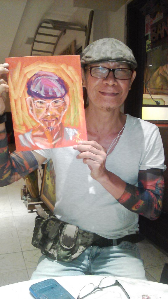
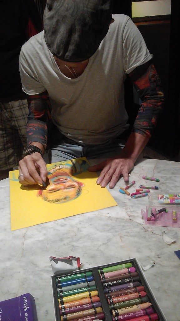
The next time I used oil pastels was in 2016, when I became a part of 2Q Artists Philippines. Two of my mentors there, Jeffrey Consumo and Abelardo Lovendino, often used it on felt paper for live portraits and still life. The renowned artists Fidel Sarmiento and Rene Robles use the same technique too, as far as I know.
A portrait of Marj, oil pastel on velour pastel paper. A live portrait I made during one of our sessions.
Jeffrey Consumo, oil pastel on velour pastel paper
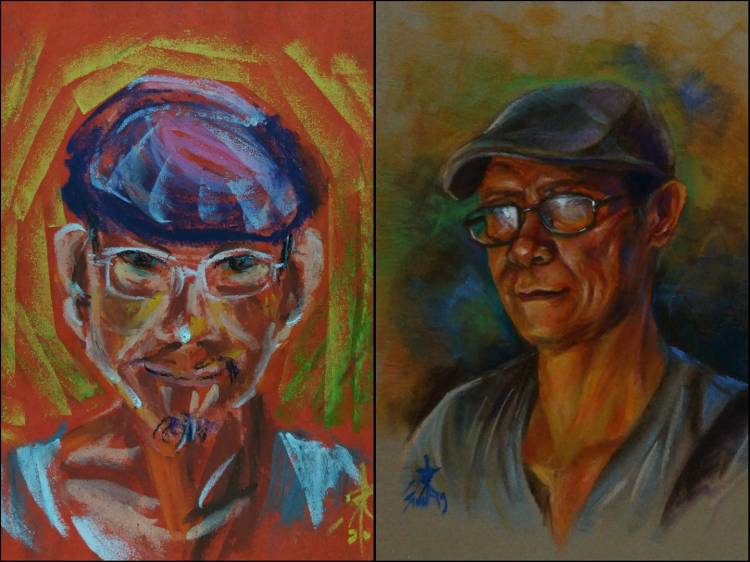
Several oil pastel portraits that I made.
My renewed fascination with oil pastels allowed me to explore other brands. Aside from the good old Pentel and Dong A, I also bought sets of Reeves (felt like bigger sticks of Pentel), Faber Castell (felt close to Reeves but a bit harder), Sakura Cray-pas Expressionist (really good all-rounder with large sticks, I regret letting my set go), Lefranc & Bourgeois (too hard for me, did not like it at all), Golden (the cheapest one found even in stores, much like Dong A), Holbein Adademic (a step above Dong A and Pentel in terms of quality and price), Royal Talens Van Gogh (Really awesome brand, feels like Holbein but has lightfast ratings that are very good), Maimeri Classico (too hard for me too, never used them for any serious work), Maped Colorpeps (feels like Dong A, just bought it for the periwinle stick), and Atlas Neons (only found in Office Warehouse shops, kinda transparent and fugitive).
Royal Talens Van Gogh oil pastels. This is the biggest size available here.
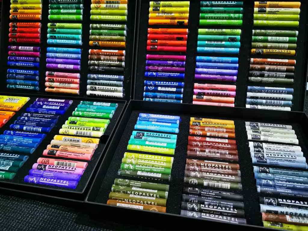
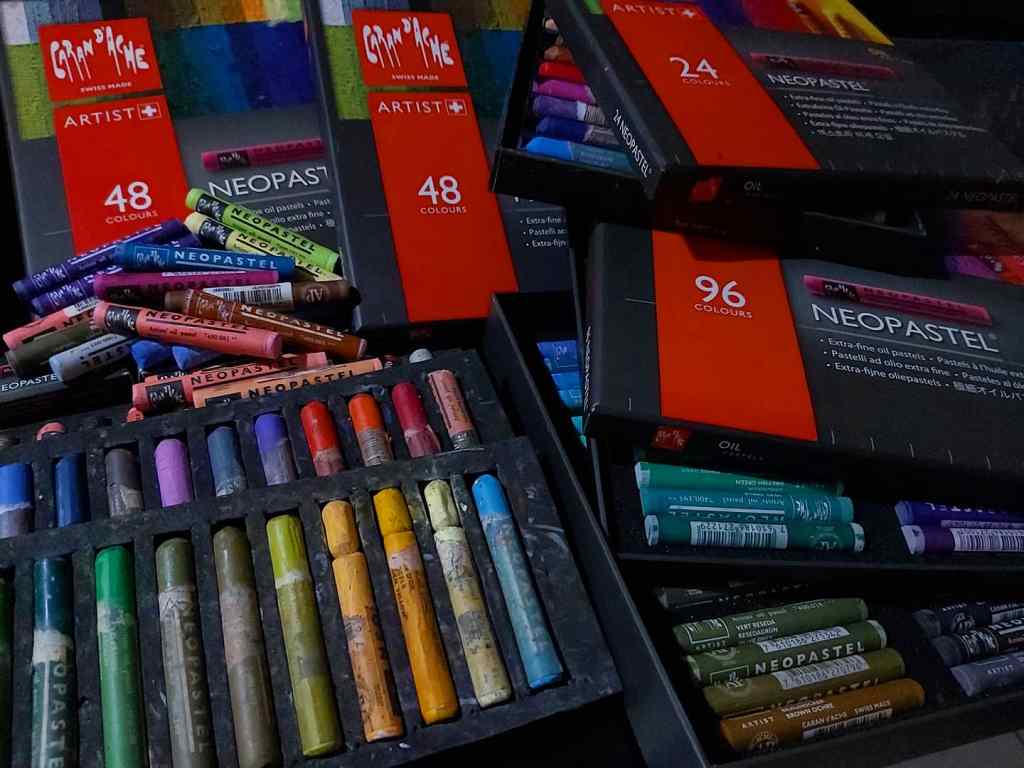
The full range Caran d’ Ache Neopastels. Worth every penny.
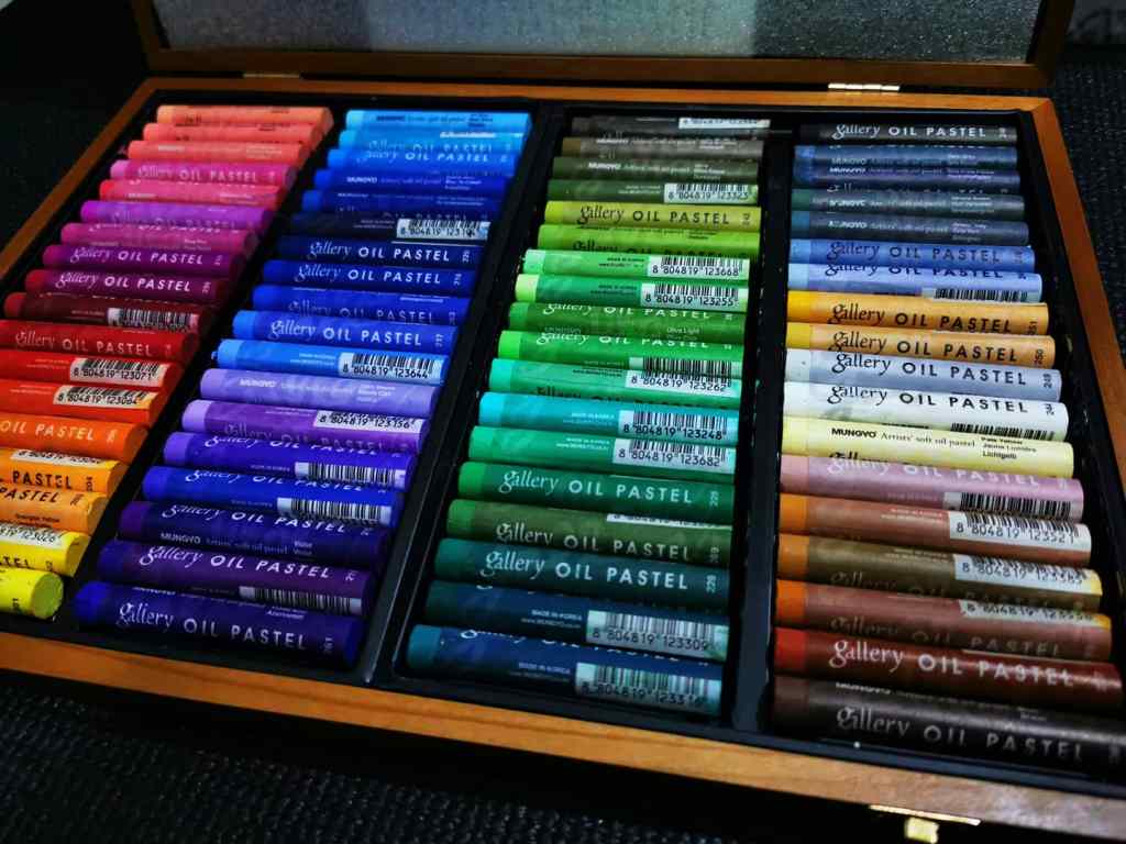
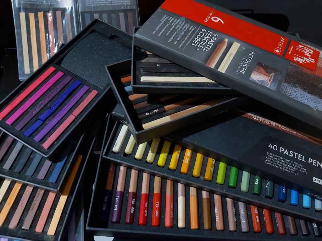
Mungyo Gallery Soft. It came in a nice wooden box.
Some student grade oil pastels that I used before and are no longer in my possession.
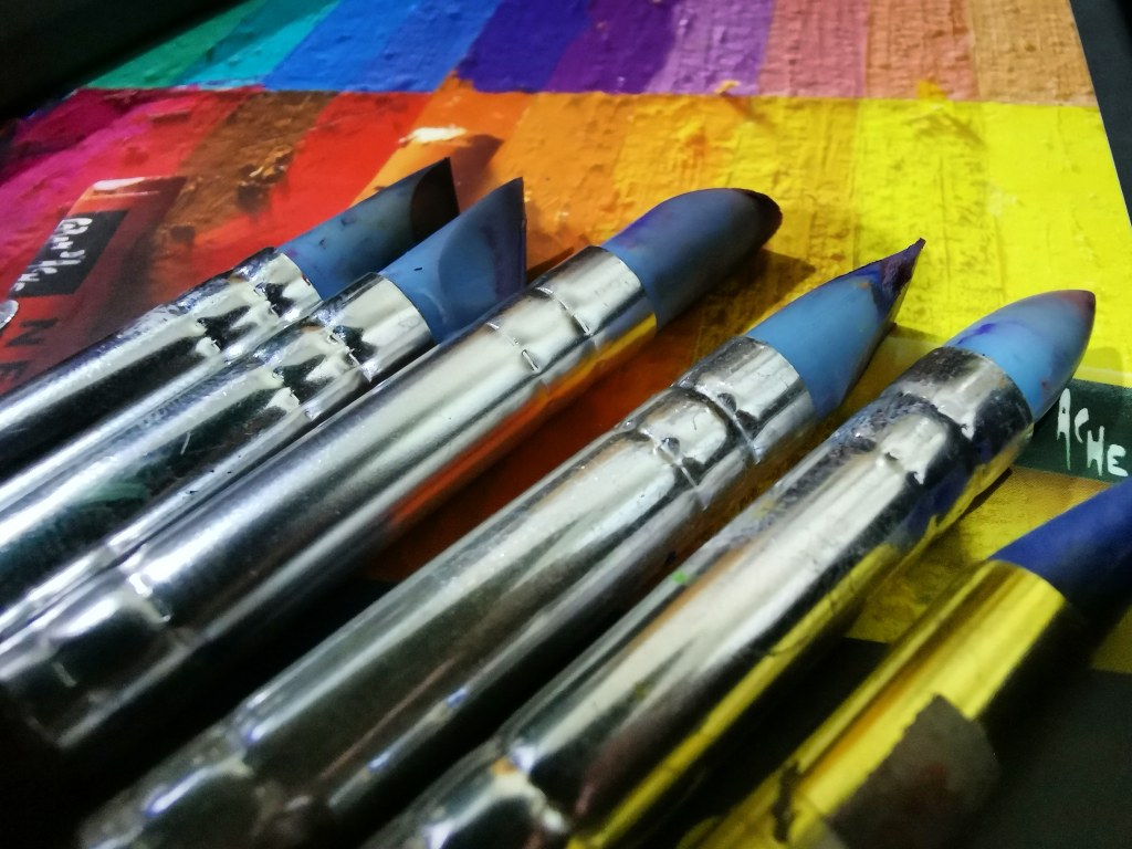
I was not a sucker for lightfastness and quality until I tried the Caran d’Ache Neopastels. They were the best oil pastels I have ever used in terms of blendability and lightfastness. I only bought them to see if they were really worth the price, and I was blown! Neopastels seem expensive but are actually economical because of the high pigment load. It can also be blended with color shapers and paint erasers, a technique I learned from the amazing Norbing Villez (he uses palette knives for impasto effects, too). This technique, as I have tried, only works well with three brands – Caran d’Ache Neopastels, Mungyo Gallery Soft Oil Pastels, and Sennelier. This is due to the high pigmentation required. The other, cheaper brands tend to form clumps, leaving a translucent layer of oil stained with some pigment.
Caran d’Ache Neopastels and Sennelier work best with color shapers.
Color shapers.
A sample landscape I made using oil pastels and Sir Norbing’s technique. This piece was part of the top five entries in a Let’s Paint Group monthly challenge. (Click to see full image)
A commissioned oil pastel landscape.
I have several sticks of white Sennelier oil pastel, and they feel like lipstick. I only use them for highlights and on top of the Neopastel layers. I also bought a wood box set of Mungyo Gallery soft oil pastels and I would say it is a good competitor for the two. The regular Mungyo gallery oil pastels are not anywhere close to the soft oil ones, I would say the regular gallery pastels are student grade and the soft oil pastels are professional.
Anywhere Forever (honorable mention, 4th Philippine Pastel Artists national pastel competition), oil pastel on paper
Now my main oil pastel rig consists of the complete set of Neopastels, Sennelier oil pastels (still waiting for the wood box set I ordered, seems like the company ceased production due to the pandemic), Mungyo Gallery Soft, Royal Talens Van Gogh, and Holbein Academic. I still have a box each of Dong A, Pentel, and Mungyo Gallery regular for teaching purposes.
I use my oil pastels on several types of pastel paper. When I was younger, I often used it on oslo paper, sketch pads, of illustration boards – all white surfaces. Now I never use it on white paper. I prefer using Canson Mi-Teintes, Hahnemuhle Lana pastel paper, and Strathmore Toned Tan / Gray 400 Series for my landscapes, especially when using Sir Norbing’s color shaper technique. For portraits, which require direct application and multiple layers, I use Hahnemuhle Velour, which is pretty much the archival version of felt paper. I have seen several artists who use them on sandpaper (or sanded paper). The rough texture of the sandpaper can accommodate more layers and allow the use of impasto-like effects, while eating lots of pastels in the process.
Still Life (3rd Place, Philippine Pastel Artists April 2020 Online Challenge), Oil pastel on velour.
Oil pastels are convenient to use, and when used skillfully they can mimic oil paints. No harmful vapors (except if you still use them with turps), no spills, and no wasteful dried up paints. The only thing I hate about them is the wax bloom, the white layer that forms on sticks after some time. This can happen on artworks too, so I always spray them with archival varnish to prevent this. I prefer Golden anti-UV gloss varnish; Grumbacher also works but it’s too shiny, almost like resin.
Though blending is possible, having a large collection of colors and varying degrees of hardness is a huge advantage. It is necessary to keep several sticks of the most frequently used colors too. This can be difficult if individual sticks are not sold locally.
My old pastel rig.
Among the other drawbacks of using oil pastels is that some pastel societies do not recognize them; perhaps due to their resemblance to oils (especially in the case of Sennelier oil pastels). Some galleries also do not accept works in oil pastel, as if they are inferior to oils and acrylics.
Nevertheless oil pastels are fun to use and can be a used as a good starting point by those who would like to immerse in the arts.
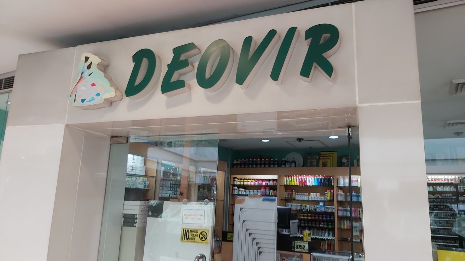
Ah, my regular site of pilgrimage (the SM Megamall branch, particularly). I have been buying materials from National Book Store for the longest time, but Deovir was definitely the one where I learned the most; especially when it comes to artist grade materials.
I first came across their SM Megamall branch in 2014, after I heard from someone that there was an art supply store there (could not remember who) and it happened that I come to the fifth floor of SM Megamall bldg. A frequently to check the music stores there. I was getting back into drawing at that time and I wanted to replenish my stock of pencils and supplies that were nearly ten years old.
I was more into guitars and effects back then and only sketched as a hobby. The materials seemed interesting but the high cost of artist grade materials, which I did not fully understand, was just too much for me and I would rather spend my cash on guitar related stuff. I only bought a few woodless graphite sticks and sketch pads and went home.
When I watched Heather Rooney’s colored pencil demos on YouTube and learned that she was using Prismacolor, Deovir was the first store that I called to inquire. I went there and bought the 36-color set, my biggest art purchase at that time, and eventually came back to buy more sketch pads and the battery-powered eraser that Rooney used in her videos. Each time I went there I always asked many questions. I did not know much about art materials, especially the difference between student and artist grades, the different brands, etc., and I did not know whom to ask except the shopkeepers there.
Most of my knowledge on art materials came from the shopkeepers, who always patiently took the time and effort to show me their stocks, to open the catalogs and books to show me what they meant, answered my never-ending thread of questions, and dealt with my woolliness before buying. Sometimes I would visit there just to ask questions and marvel at the sight of their merchandise. The shopkeepers were also very honest about their goods, they told me which was good or better, had greater value, who uses specific products, even their experiences in using them! It was a true place of learning for me.
My stash of materials from 2014. Most of these were bought from their shop.
At first I only bought student grade materials. I had been buying student grade stuff from NBS before and the results always seemed good enough for me, and I was too broke and stingy to splurge at that time. My purchase of Prismacolor pencils from them however taught me that quality indeed came with a price and that there was a huge difference between cheap student grade materials and professional, artist grade ones.
Eventually my involvement in different art groups and events opened my eyes regarding the need to buy better materials. It was in Deovir where I bought my first artist grade variants of all media that I use (acrylic, oil, pastel, watercolor, and gouache). It took me many years to get the materials because they were indeed expensive. The shopkeepers there were kind and gracious enough to help me get started and build up my collection. I learned more with each visit and purchase and the items I bought from them really helped me improve the quality of my works.
What I like best about their shop aside from the nice people is that they have a large selection of art materials, from student to artist grade. They also carry several brands that offer excellent quality at great value. Over the years I was able to buy a lot of items from them, such as the following:
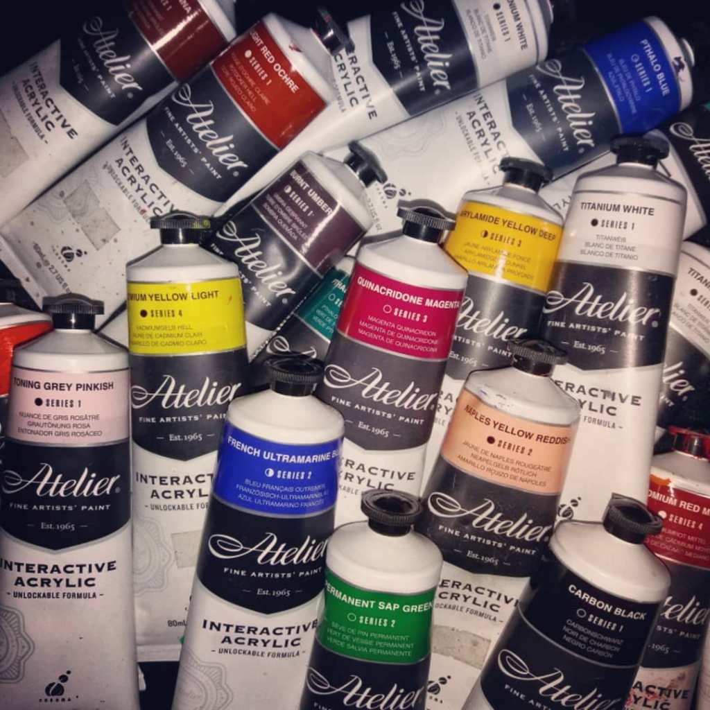
Acrylics – I use Chroma Atelier Acrylics for my serious works and commissions. I also love their Royal Talens Amsterdam and Nevskaya Palitra Sonnet acrylics. I also got a number of Marie’s acrylics from them too.
Some of the acrylics I bought from them
Paintings I made using solely Atelier Interactive acrylics
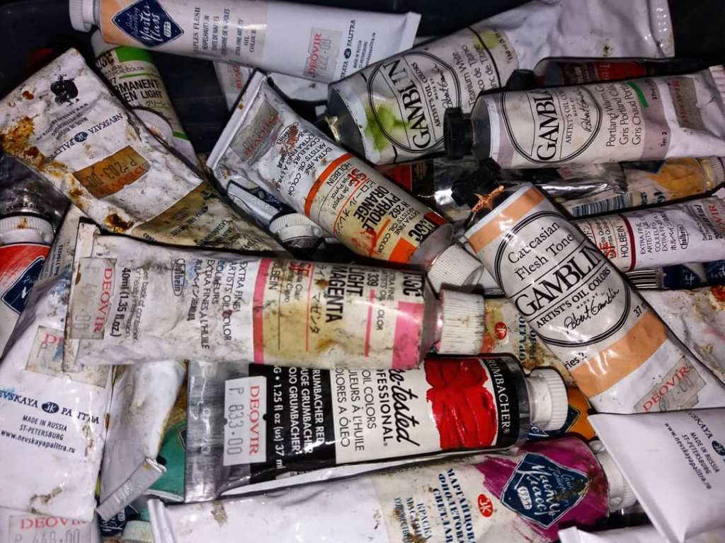
Oils – I bought my first set of oils from them, and it consisted mostly of Talens (China) and Marie’s, Grumbacher Academy, and Royal Talens Amsterdam. I sold all of my student grade oils and now use Gamblin, Koh-i-Noor Prague, Nevskaya Palitra Masterclass, and Holbein artist grade paints, which I also bought from them. I am still saving up for those dang expensive Old Holland tubes.
My stash of artist grade oils from Deovir18 in. x 24 in. Oil on canvas 2020 Photo reference from Mr. Santos Sulbise Jr. I made this using oils purchased solely from Deovir.
Oil painting mediums and solvents – I love their Gamblin Gamsol and Archival Oils Fat and Lean mediums, as well as their Winsor and Newton Liquin.
My lungs love them
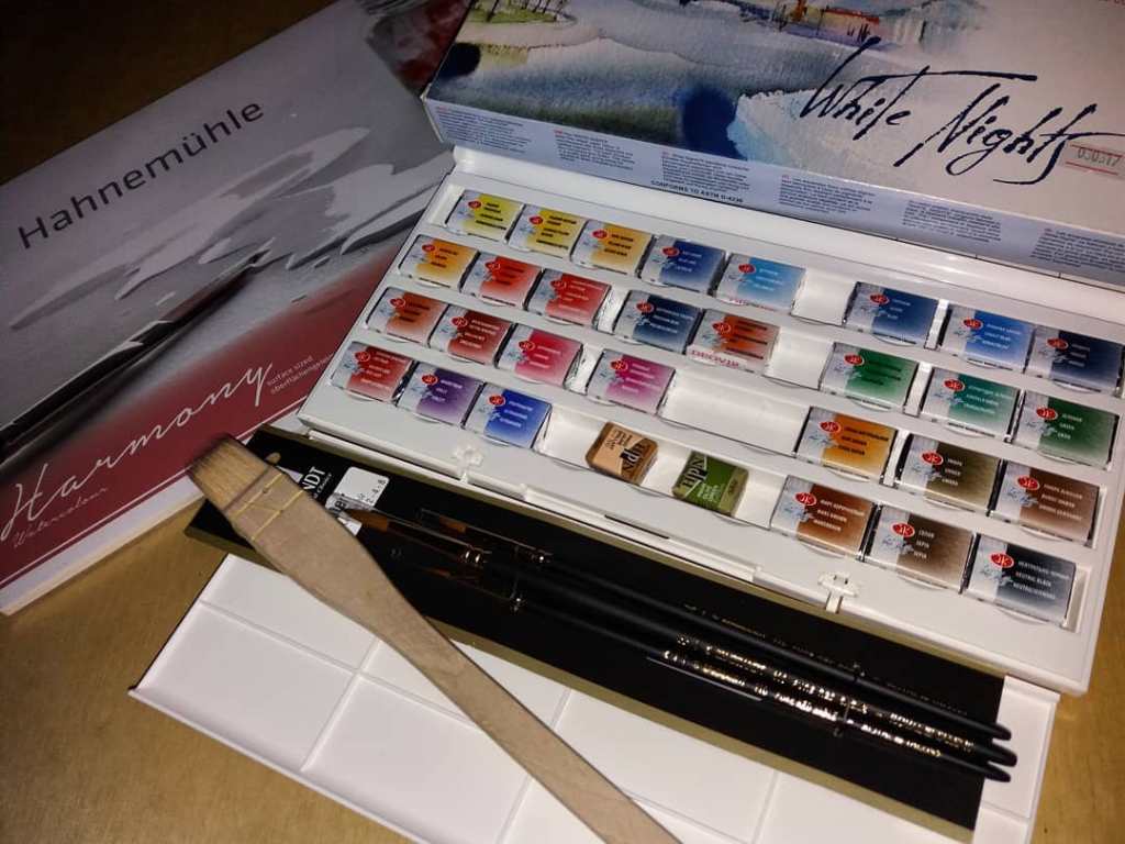
Watercolor – I rarely use this medium. My main palette consists of paints I bought from them, such as Nevskaya Palitra White Knights, Rembrandt, and Holbein. They are all very rich and vibrant.
My first set of artist grade watercolors, brushes, and pad; all from Deovir
Gouache – I have tubs of Royal Talens artist grade gouache that I bought from them recently.
A gouache painting I made using Royal Talens gouache
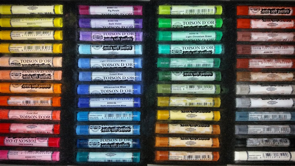
Pastels – Deovir is the only store where one can buy Royal Talens Rembrandt medium soft pastels, my favorite and main workhorse. They have sets and open stocks. I also bought sets and open stocks of Koh-i-Noor Toison D’Or extra soft pastels and its variant the Gioconda pastel pencils that complement the Rembrandts really well. I also have their Royal Talens Van Gogh and Holbein oil pastels that I really love, especially for portraits.
Some of the pastels I bought from them
Pastel paintings I created using only pastels I bought from Deovir.
Colored pencils – I bought my first set of Prismacolor pencils from them, as well as some Koh-i-Noor Polycolor and Faber Castell Polychromos (that they used to have). I have shifted to a different brand of colored pencils but I still keep the pencils I bought from them and use them for studies and other pesonal stuff.
Fixatives and Varnishes – I have their Grumbacher workable and final fixatives as well as their Golden archival varnish spray with UVLS.
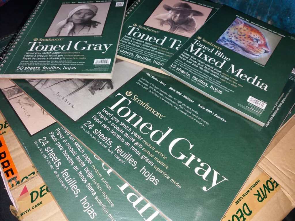
Papers and pads – I love their Strathmore Toned series (tan, gray, and blue) and other pads (bristol vellum and pastel), as well as their Hahnemuhle Lana, Velour (both for pastel), Cezanne, and Harmony (both for watercolor).
Some of the papers and pads I bought from them.
Brushes – I bought most of my best quality brushes from them, and this goes for acrylic, oil, gouache, and watercolor.
Other tools and accessories – my wooden studio and aluminum travel easels, erasers, color shapers, paper stumps, carrying cases, and so much more!
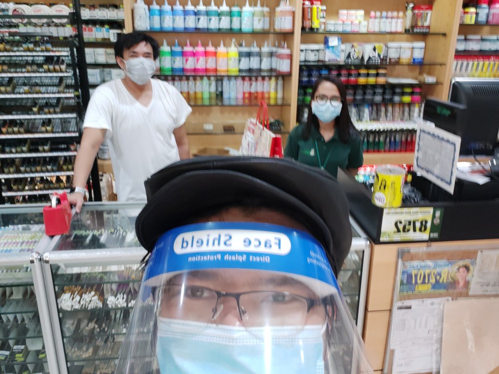
When the quarantine restrictions were downgraded and shops reopened in May of this year, it was the first shop I visited. It was around four kilometers away from our home, and I took the risk of getting there on foot! Thank God I came across an electric bike driver who gave me a ride. I was really happy to see them again.
A simple selfie with the shopkeepers and my haul after the long lockdown.
I will continue buying from their shop for as long as they remain open. Though I use other brands and buy from other stores too, the materials I bought from them constitute the very foundation of my working process. Their SM Megamall branch in particular feels like home, and I will always cherish that place as a very important part of my roots, of my art career itself. The continuous learning, the awesome materials and great value, and the very nice people are just some of the reasons why I would keep coming back. I never would have known and accomplished everything in my art career without Deovir, and neither would I get anywhere without their help, too. And no, this ain’t a paid ad.
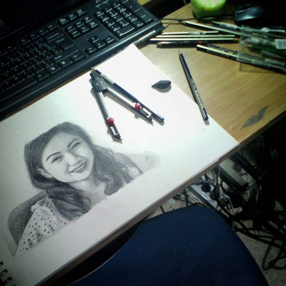
In 2014, I got hooked into making graphite portraits. I was only more of a hobbyist and relied heavily on YouTube tutorials. One day I came across the videos of Heather Rooney on YouTube. I was stunned by her ability to create photorealistic pencil portraits. At that time she was still using Prismacolor Premiere soft core pencils. As I wanted to do the same thing, I bought a set of 36 colors worth more than Php 2,000.00. Prismacolor pencils were more expensive and uncommon at that time and the quality, especially the wood, was much better. It was my biggest purchase of art materials that it made me break out in cold sweat. I knew that quality came with a price, but I did not exactly know how it applied to art materials. All I knew was that as long as I was using the same colors or brand, it should be fine.
Some of my 2014 sketches using graphite and Prismacolor pencils.
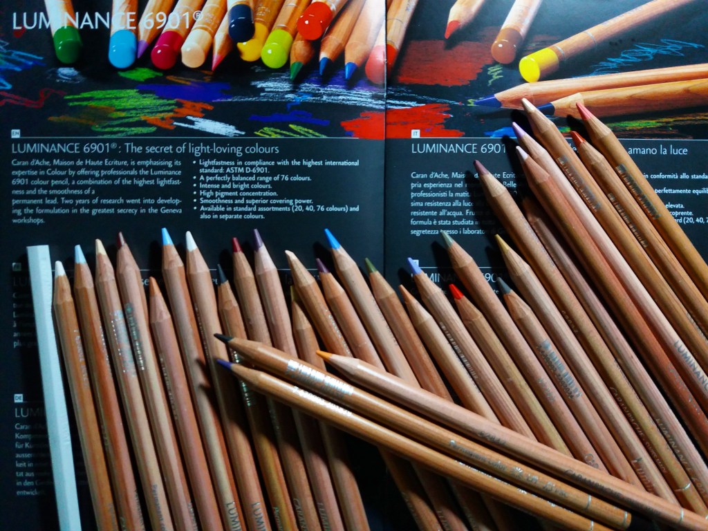
I was still learning how Rooney did it when she suddenly switched to Caran d’Ache, a brand I never heard about before. I did not even know how to pronounce it. She had positive reviews of the brand; hence I wanted to get my hands on it, too. However, it was unavailable locally, so I had to stick with Prismacolor pencils for the meantime.
In 2016 I joined 2Q Artists Philippines and thus visited Shangri-la Plaza regularly every Saturday for our sketching sessions. I often dropped by the National Book Store branch on the ground floor to buy art materials. I could not remember when exactly I first saw it, but the NBS branch there suddenly had a separate section for Caran d’Ache! (as per Ms. Jessica of NBS, it was around October or November) Finally, the brand was available! Curious, I immediately looked at the prices. I saw a box of the Caran d’Ache Luminance pencils, the one Rooney was using. Dang, it was expensive! So much for trying to learn Rooney’s techniques. I also saw that they also made other media like oil pastels, graphite, and the Neocolor series that looked like the typical crayons to me, and learned that they were all expensive yet many known artists use them. Usually I would visit that section, just to look at the stocks in frustration, and often said I would never spend that much money on art materials while shaking my head. Sometimes my fellow artists from 2Q would come with me, and we would hang out and create sample artworks with the testers and gave them away afterwards.
In late 2018, two years after NBS had its own Caran d’Ache section, I dropped by again to window shop in frustration. Rooney said it was good and some local artists are using it, but it was worth serious money. The truth was I could afford it, especially if I saved up; I was unsure, however, if it was worth the investment. They had new items on display and to my surprise, they were now selling open stocks of the Luminance pencils, Neopastels, and other media! A single Luminance pencil cost Php 150.00 while their Neopastel cost Php 99.00 per piece. It was finally within my reach. I did not have much money at that time and I was not sure what to buy first, so I bought some skintone Luminance pencils, blender sticks, and some of their Neopastels to complement the materials I already had. When I got home, I made a few swatches and compared them with the brands I was using. I was blown away by the quality. I already had a few artist grade pencils at that time, and they were also good; but the Luminance pencils really lived up to its name and reputation. The same went with the Neopastels, they were creamy and the colors were intense! At that time I was collecting art materials of different brands, too. I had just learned about the concept of lightfastness (thanks to negative reviews pertaining to the lightfastness of Prismacolor Nupastels and Premiere pencils which I bought a few days earlier and sold just a week or so after), and Caran d’Ache had high ratings on the Blue Wool Scale.
My first purchase.
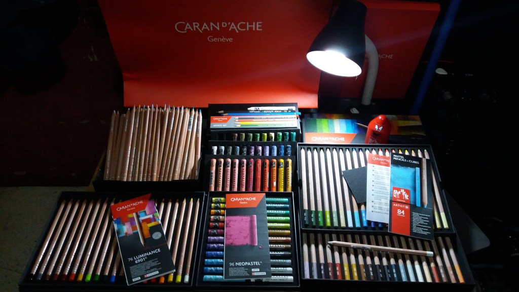
Since that day, I saved up my cash so I could buy more Luminance pencils and Neopastels every week or payday. On December of that same year, NBS had a big sale, hence I was able to buy more, such as the pastel pencils and cubes and some small boxed sets of Luminance and Neopastels (the boxes were more like a collector’s item for me). Yup, that’s where I spent all my bonuses and even part of my savings for that year.
My second purchase. I bought a few pieces every pay day, and bought more upon receiving my bonuses and payments for art commissions.My Caran d’Ache collection by December 2018
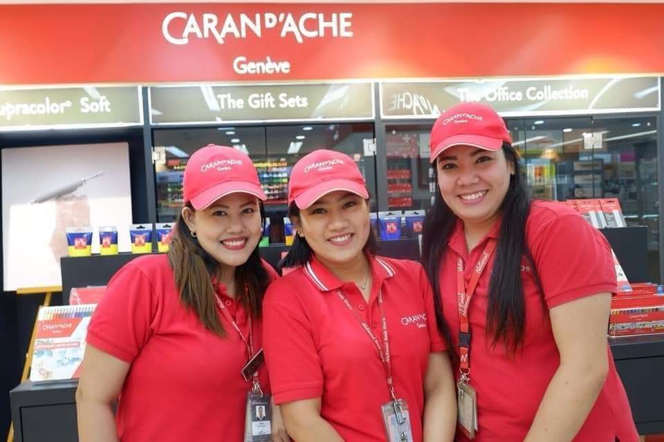
The ladies who handled the brand, Ms. Jessica, Ms. Judy, and Ms. Mia, were very nice and they always accommodated my inquiries and requests. They were really kind. The endless questions about their products and offers and the indecisiveness I always seemed to have before making a purchase would annoy many, but they were really patient, even honest and genuine. They did not just help me learn about the brand, they helped me grow, too, as an artist. Dropping by the Caran d’Ache section eventually became a habit. It felt like another home (much like Deovir; that would be another story and article).
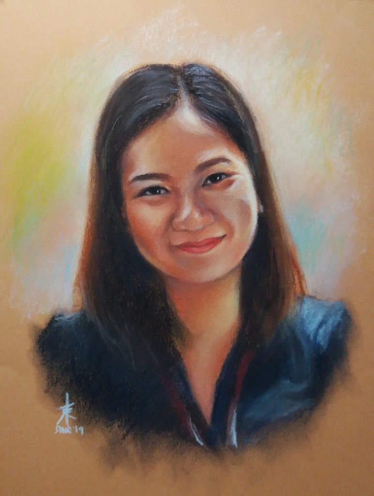
The ladies of Caran d’Ache (left photo): Ms. Jessica, Ms. Mia, and Ms. Judy. I made Ms. Mia a portrait using Caran d’Ache pastel pencils. The video can be seen below.
I spent a great deal of money on Caran d’Ache. Some thought and said that it was too much, but I always thought of my purchases as an investment (I will make a separate article on using professional grade materials). Honestly, I was initially hesitant to use them due to the price: I only used them for commissions and serious projects, except for some unique hues that I brought to our regular sessions. Sometimes I took my stocks out for a spin. The high costs somewhat made me feel uncertain about the sustainability of using the brand. This fear became greater during the pandemic, as many shops had to close and the production and shipment of some art materials slowed down or even halted. I would always tell myself that quality came with a price and I need to take risks.
A live portrait of my friend Shayne that I made during one of our 2Q Artists Philippines sessions. I used Caran d’Ache pastel pencils and cubes for this one.
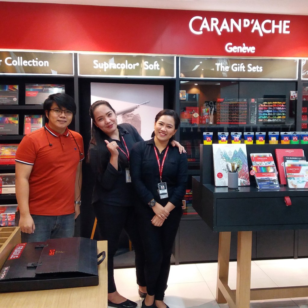
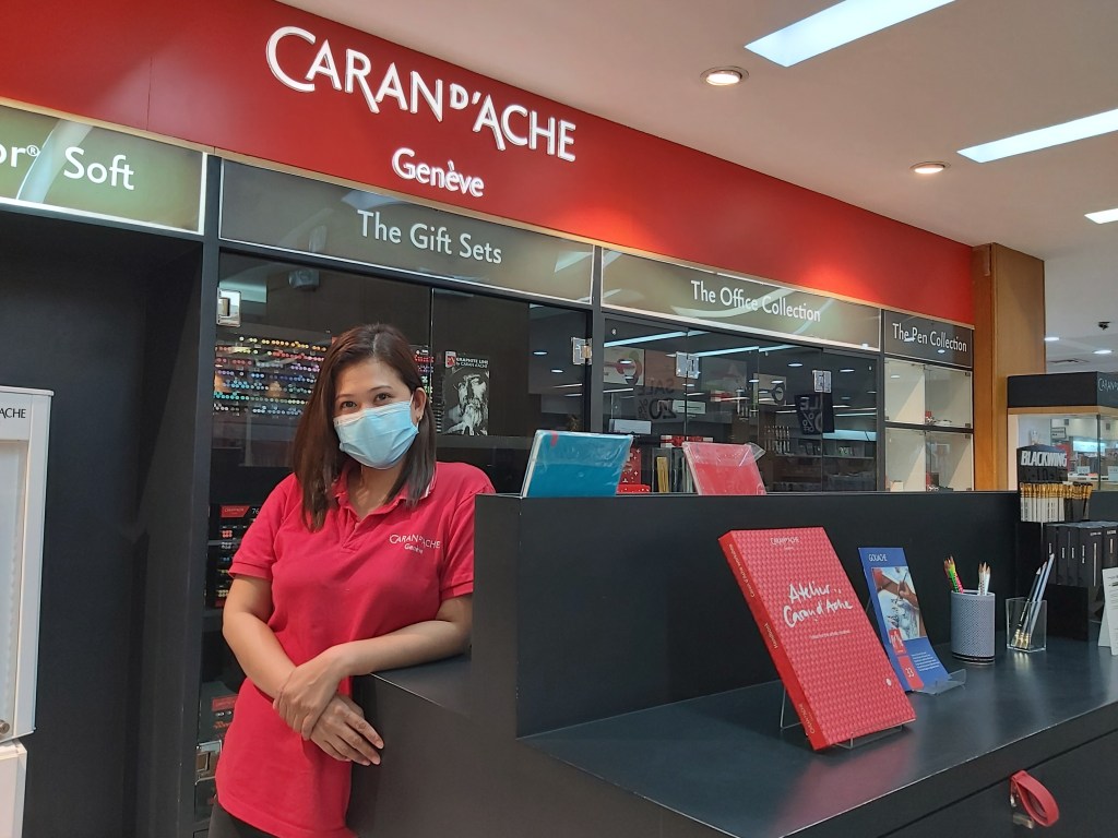
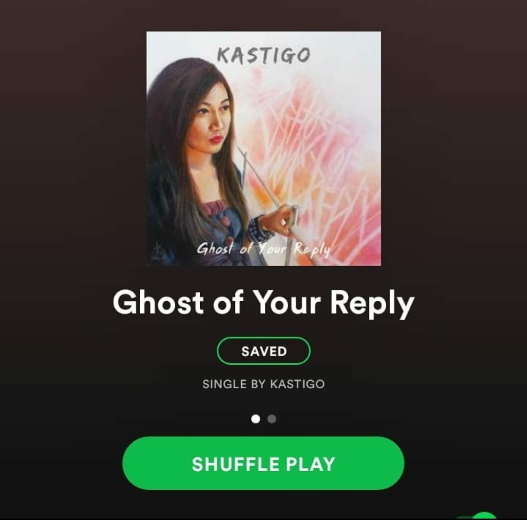
Cover artworks for two of Kastigo’s songs, Ghost of Your Reply and Fat Slap. I made these using Caran d’Ache Luminance Pencils and Neopastels. I strongly recommend checking out their music!A photo of Ms. Jessica taken recently. Many items were taken off the shelves during the pandemic; the reduced workforce increased security risks for their merchandise.
Two years after my first Caran d’Ache purchase, I shifted more into pastels and I did not use the Luminance pencils that much; at least I would not have to worry in case a project involving colored pencils came up. During the lockdown period I purchased a number of their Supracolor 2 and Museum Aquarelle pencils and their Gouache tube set too (thanks to James Gurney’s YouTube tutorials and my impulsive nature).
A small painting I made using Caran d’Ache studio gouache. Inspired by James Gurney’s YouTube videos.
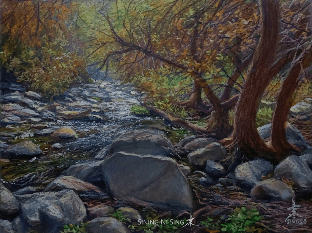
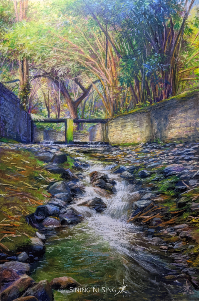
Just recently (late 2020), Sir Norbing villez, the leader of Let’s Paint group, made a series of artworks in which he used Neopastels as his main medium. He used color shapers to push the colors around the paper and palette knives to lay down colors, creating amazing effects and the finished work looked much like oil paintings. His technique got me hooked that I tried it immediately. His technique did not work well with the other oil pastels that I had, hence I had to use out my Neopastels too. And voila! It changed the way I would make oil pastel paintings forever. All of the Neopastel landscapes I made recently (Cool Waters 10, 11, and 12) had been sold, too! I also used Neopastels for my entry to the Philippine Pastel Artists, Inc. National Pastel Competition for this year.
The Neopastel landscapes I made recently. Inspired by the works and technique of Sir Norbing Villez. Details are available in the gallery page.
Earlier this week and after two years of saving up and building up the guts needed, I finally bought the 96-color / full set of Neopastels. It really cost me a fortune, the cold sweat was there as always, but I knew that it was a wise buy. I always wanted to be at my best each time I would make an artwork, not just in terms of technique but also in terms of materials.
As per my experiences, the Caran d’Ache artist grade materials would definitely be a worthy addition to an artist’s arsenal (no, this is NOT a paid ad). It’s worth the money and it could indeed unlock greater creative possibilities. I would most likely continue using their materials (with other artist grade brands), not just because the people I look up to are using it, but because my technique and the quality of my works also rely upon it.
July 16, 2016 started as a typical Saturday. After leaving the office at around 2:00 PM, I went to the EDSA – Shaw Boulevard area to buy a new backpack. After hours of looking around in SM Megamall, I could not find anything that seemed like a good replacement for my five-year-old Hawk bag that broke down due to years of abuse. I felt somewhat nostalgic and empty, as if I was searching for something I did not know. There were a lot of good stuff there, but somehow I did not like any of them.
Not wanting to go home empty handed, I decided to check the other malls. I ended up in Toby’s Shangri-la Plaza, where I found a black Deuter Giga backpack that somewhat caught my interest (I still use it to this day). It was not the best, but perhaps because I did not want to go back to SM Megamall I decided to buy it.
Normally, I would head straight home, but upon leaving the store, I felt this urge to stroll a bit, as if something was prompting me to explore the area. It was the same feeling of restlessness and nostalgia that I had earlier, which seemed odd because I had already found what I was looking for. I decided to obey that prompting.
I soon found myself on the mall’s fourth floor. I did not know that Shangri-la had an Art Plaza before. Curious, I checked out the galleries and the artworks therein.
I first entered the Summit Art Gallery and asked the curator, Miss Eugene, if they accept consignments, among other things. She kindly answered my questions and told me to submit my profile. Since things seemed to go well on the first gallery, I decided to push my luck further by checking the other galleries, too.
The gallery on the opposite side of the hallway caught my attention. It seemed dimly lit, unlike the others. There were some fine gentlemen seated as they conversed outside. As I entered the gallery’s door, I looked up and read its name, Bangerahan. It turned out that they were not only selling paintings, but antiques too. Talk about a good way to satiate that nostalgic feeling I had earlier.
A man approached me and asked what I was looking for. I introduced myself as an artist and said that I would like to know if they were accepting consignments. Upon learning that I was an artist, he introduced me to the gentlemen conversing outside the gallery.
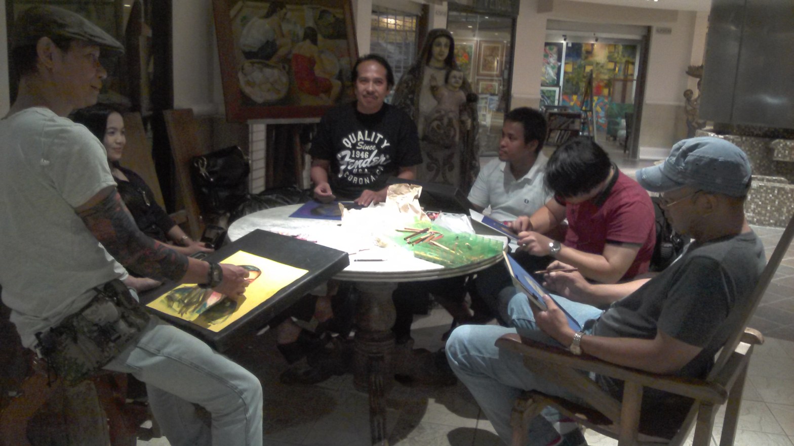
I met the gentlemen who would eventually become my mentors – Mr. Jeffrey “JeffCon” Consumo, whom they introduced as former President Cory Aquino’s painting teacher (of course I was starstruck), Mr. Abelardo Lovendino, and Mr. Romeo Montes. It turned out that they were planning to hold sketching sessions there. Of course, I said I would like to join, even though I was such a noob. They said it was fine and asked me if I was free on Sundays. I said no, and politely explained that I have Church duties. When they asked me what my religion was, I said I was a member of the Church of Jesus Christ of Latter-day Saints. The gentleman with the moustache (Bro. Abe, as I call him now) suddenly raised his hand, as if he was offering to shake mine. He told me that he was a member of the Church too and that he won its global art competition years ago; he was even commissioned by the Church to paint the Garden of Eden on the lobby / reception area of the Manila Philippine Temple and other works that were featured on conference messages! I was astonished. It turned out that I was right to follow the prompting. Kuya Jeff (as I call him now) said that what was happening at that time was no coincidence – it was destiny. As a fan of numerology, he noted how the numbers seemed “lucky,” it was July 16, 2016, which in a way forms 777 (7, 1+6, 1+6). I was never fan of numerology but it really struck me, 777 was my favorite three-digit number (blame it one Steve Vai).
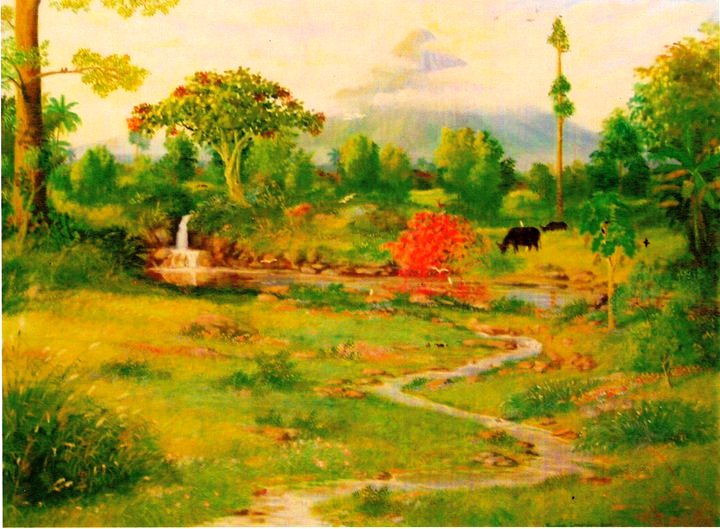
Bro. Abe’s painting at the Manila Philippines Temple
The meeting was quick. I was tired and overwhelmed by the events. They told me to prepare oil pastels and felt paper, it would be our medium and support on our sessions. I went home excited. It was the beginning of something new.
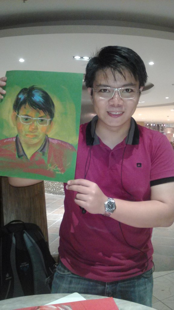
The next Saturday, July 23, we had our first session. I did not know how to do on-the-spot portraits, especially when using oil pastels on felt paper! I only resumed painting the previous year (2015) and I was pretty much dependent on a white surface and my palette of acrylic paints. The last time I used oil pastel was in 2004, when I was a college freshman, and I did not even know that it was possible to do it on a colored support, especially on felt! Kuya Jeff challenged me to a “duel,” we would sketch each other in real time. I took his challenge head on and realized how much of a noob I was. I never struggled like that while drawing in my entire life! I just did not know how to make it work. The odd colors, the unfamiliar texture of the felt, the pressure of “dueling” with an accomplished artist swept me off my feet. He was able to make my portrait in a matter of minutes. I struggled and kept on apologizing as I finished his.
My portrait, which Kuya Jeff finished in a matter of minutes. I still hold it as my most-prized portrait to this day.Kuya Jeff holding my portrait. He was kind enough to do this photo op, even if my work sucked big time.
Kuya Jeff, Bro. Abe, and Kuya Moyo Montes were really kind, they encouraged me to continue and helped me figure out how to do it. It turned out that they were more into impressionism, a method I only knew by its textbook definition. They taught me many things, from capturing the sitter’s character to using the medium effectively. I was not a fine arts graduate and I could not easily understand the tips, and there was just too much information for my mind to process. I could not believe that it was fine to use light blue on the cheeks, to use purples for shadows, and allow parts of the colored felt to show through. To them it seemed so easy, I felt this immense pressure that I may not be able to keep up. However, their encouragement and kindness helped me believe that perhaps someday, I would learn how to do it too.
While waiting for the sitter, we made Kuya Emeng, an art and antique broker, a quick portrait. This time I used graphite on my sketchbook. I tried to match Kuya Jeff’s speed. Man, he was really quick! And to think he used oil pastel on felt.
Soon our sitter arrived and it was time for the session to begin. All I could think of was redeeming myself.
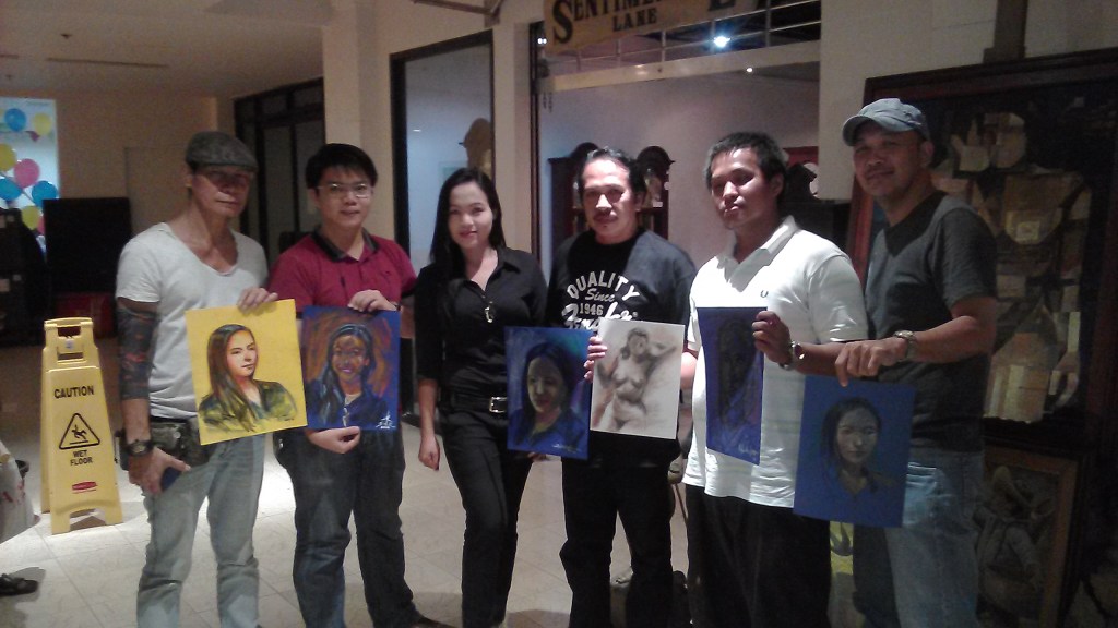
Our first session. From left: Mr. Jeffrey Consumo, our sitter, Bro. Abelardo Lovendino, A certain “Bal” who never showed up again (we are still looking for him), me, and Mr. Romeo Montes.
Their words really helped me overcome my struggles earlier. It was not easy, but I was able to complete my sketch and it seemed much better than the first one. They said I was able to capture the sitter’s character and that I had my own style (which I did not fully understand at that time). I had this intense feeling of happiness and gratitude. I survived!
My work and the sitter.
After our first session. Bal was holding another artwork, he was really happy about it that day, I could not remember who made it.
My first session with the group was fruitful; an experience I would always cherish. It was a day of many firsts: My first on the spot portrait, my first time to use oil pastel on felt, my first live portrait session, and my first time to learn under the tutelage of accomplished, professional artists. I went home exhausted yet somewhat relieved, I was pushed far beyond my limits. I realized that I still had too much to learn (I still do to this day), good thing my mentors were there to guide me.
I have confirmed that the fateful meeting we had a week ago was no mere coincidence indeed. It would direct my activities in the succeeding years and change my life forever.
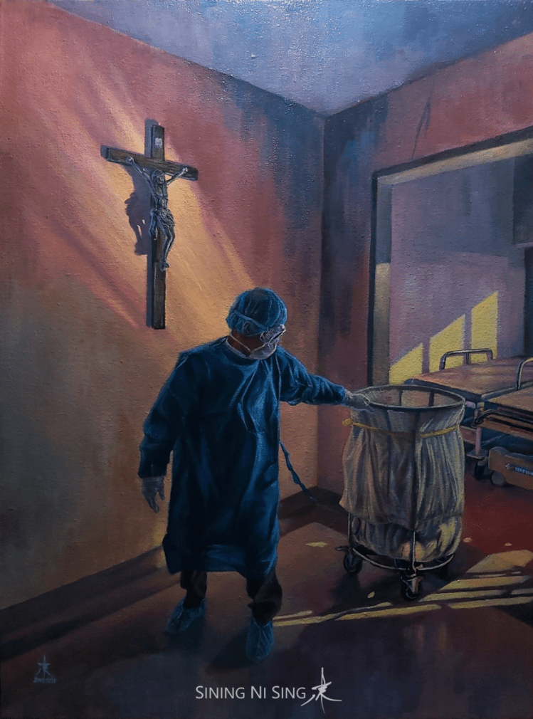
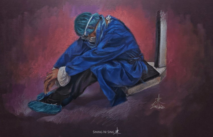
These artworks are dedicated to all the health workers and frontliners risking their lives to protect us from COVID-19. Thank you very much for your sacrifices. My thoughts and prayers are with you. May you all feel the love of the Savior, especially during this difficult time.
Fear not, I am with thee 24 in. × 18 in. Acrylic on canvas 2020
The title was inspired by the third verse of the hymn “How Firm a Foundation” “Fear not, I am with thee; oh, be not dismayed, For I am thy God and will still give thee aid. I’ll strengthen thee, help thee, and cause thee to stand, Upheld by my righteous, upheld by my righteous, Upheld by my righteous, omnipotent hand” (Text: Attr. to Robert Keen, ca. 1787. Included in the first LDS hymnbook, 1835. Music: Attr. to J. Ellis, ca. 1889)
After Shift 12.5 in. × 19 in. Soft pastels on Strathmore Grandee paper 2020
My grab-and-go sketching kit for live portrait sessions and come-what-may art trips is heavily inspired by the YouTube videos of Davy Lim and my 2Q and online mentors.
I purchased the organizer box from Facebook Marketplace for less than Php 400.00. Ain’t easy to find a box of this size and for the price it’s quite a steal.
I lined some of the sections with EVA foam to reduce impact damage on the pastel pencils and prevent core breakage. I however could not add foam to the cover, thus making it the weak spot. I also added a small bag of silica gel to absorb moisture.
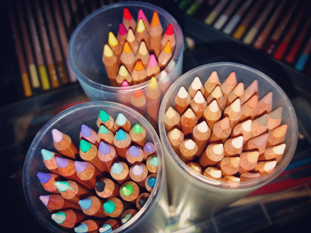
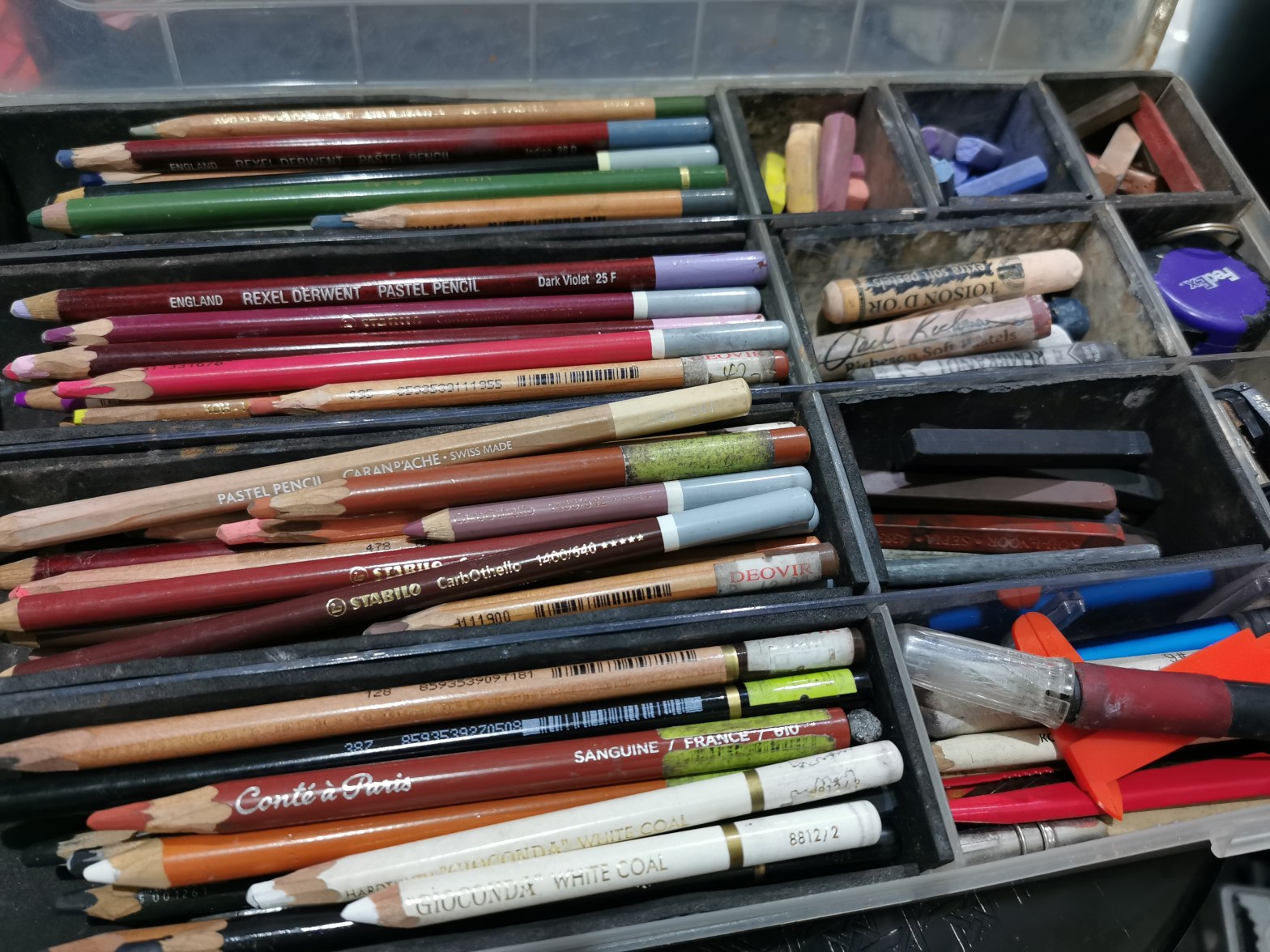
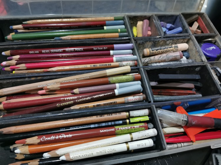
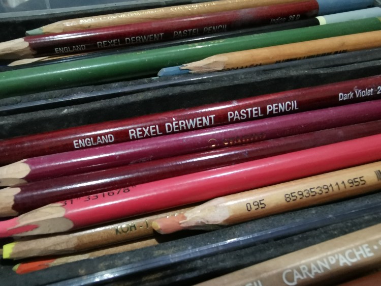
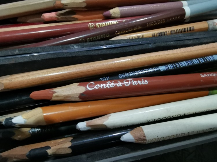
I store my pastel pencils in three separate sections: warm, cool, and skintone. This makes it easy for me to find a specific color while working. I use six brands: Conté a Paris, Stabilo CarbOthello, Koh-i-Noor Gioconda, Derwent, Faber Castell, and Caran d’Ache.
One section contains sketching pencils – sepia, sanguine, black, and white lead pencils; charcoal; and graphite from Conté a Paris and Koh-i-Noor Gioconda. A separate section holds the stick version of the pencils.
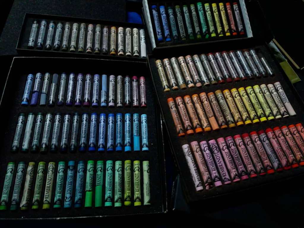
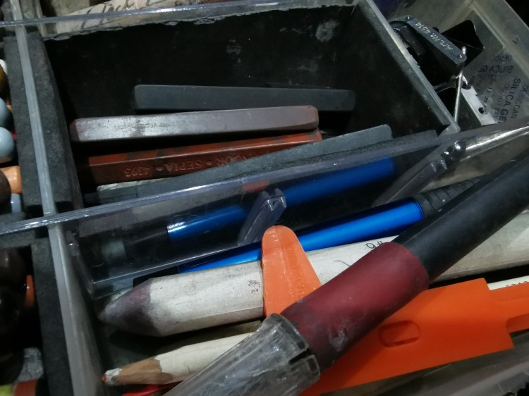
Several sections contain soft pastel sticks from Jack Richeson, Royal Talens Rembrandt, Holbein, Koh-i-Noor, and Caran d’Ache.
The kit also has a numbrer of accessories like rubber and kneadable erasers, a Kum Magnesium and Stabilo sharperners, binder clips, paper stumps, a cutter and craft knife, a mini caliper, pencil extensions, a measuring tape, and a sandpaper block.
I use this kit with a 24-color set of Conte a Paris Carre crayons, hard pastels for blocking in sections of color faster.
I’ve been using this kit for quite some time now and has proven itself handy even in tight spots and venues where tables are unavailable.
I first saw Kastigo play live in B-Side Makati way back in 2014. Though I have heard about them a couple of times, I didn’t really know much about them back then, except Sir Mico Ong of Fuseboxx and one of my guitar heroes was also their member. They were the last to perform and I did not know that I was in for a surprise.
A photo of Kastigo that I took during 9th anniversary gig in 2014
The band’s music and stage presence left a lasting impression. The songs dug right through my heart and brought out all the rage kept within, among other emotions. I definitely need to watch them again, I thought.
Then came the band’s ninth anniversary gig in Manila Bikes and Choppers. This time I got to see them more up close. Their charisma and stage presence that night seemed unparalleled. I really admired everything about them. I became a fan.
I bought a copy of their first album and never stopped listening to their songs ever since. I even tried to learn their songs and even made a cover video. I wanted to see them again, but it seemed impossible because of some life decisions that almost made me quit music and stop watching gigs. I only followed them online, through their social media acitivities.
Late last year, I was asked by the band to create the cover artwork for their latest release. I could not believe it; there were more skillful and even more popular artists out there and they still chose me.
Working on the artworks was indeed a challenge. The fear of the band’s disapproval riddled my mind. But they were always very supportive and gave me absolute freedom. My respect and admiration for the band grew even more.
It may sound cliche if I would call it a dream come true, but it was! A wonderful blessing I would always be thankful for. I love the band and their songs (#relatemuch hehe). It was and would always be a great honor to work with them.
Maraming, maraming salamat, Kastigo. Congratulations and mabuhay kayo.
P.S. To those who served as my model, thank you very much too.
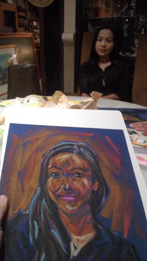
I never knew that it was possible to create pictures using oil pastels on felt until I joined 2Q Artists Philippines. I could still remember how nervous I was when I first tried it, especially in the presence of the founders and my mentors Jeffrey Consumo, Abelardo Lovendino, and Romeo Montes.
I tried to recreate the first artwork I made using oil pastels on felt (I used Velour pastel paper, which is archival felt paper in a nutshell).
I never would have learned how to do this without their guidance.