I officially retired from being a social studies teacher after 16 years of teaching and 15 years in the government service. It was not an easy decision, in fact it took me more than a year to weigh things and decide as I was passionate about teaching and social studies. I loved my job and my colleagues were awesome. But my health comes first. I do not wish to speak much about it, but here’s a hint – Klippel Trenaunay Syndrome, and its complications.
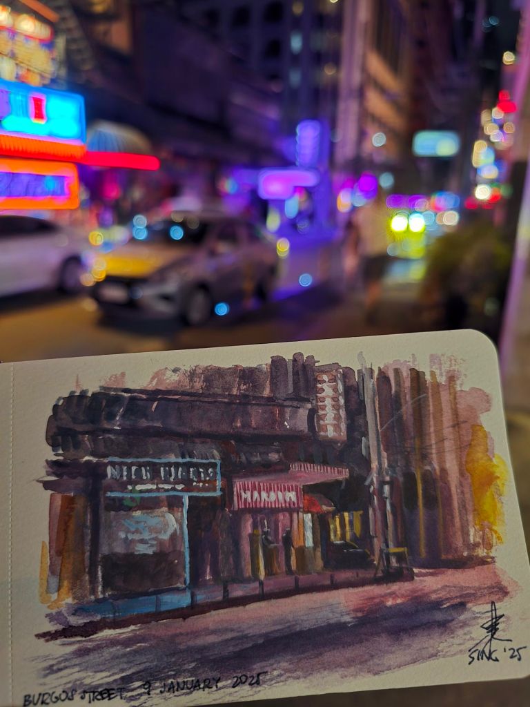
A watercolor sketch of a nightclub with neon lights while inside a nearby convenience store. It ain’t easy to achieve the neon effect especially with the materials I had at the time, but it was a good experience. While painting, I realized how much time and freedom I have to do sketches like this as a full-time artist.
I am writing this over three weeks after going full-time. I am still doing some leftover tasks from my previous job while getting the hang of my new routines. Time seems more abundant, as long as I do not get distracted. The joy of doing what I love while taking care of my health more than ever before is real. I can now paint and sketch without worrying about coming to work the next day. Over the past weeks, I was able to do more plein air and join more painting sessions. I was able to read and study the art books I purchased long ago. I was finally able to update my website and even create more content to help people get more acquainted with what I do.
A sketch I made inside a coffee shop near my residence on a weekday afternoon. Back then I could only do this during holidays or weekends, in rare occasions in which there were not a lot of people inside.
I feel overwhelmed about the things I was able to do within a short span of time. I wonder how things could have been if I did this long ago.
I have realized, however, that grit and discipline has become far more important. It is easy to get mislead by the idea that I am my own boss and I have all the time in world. The absence of a regular paycheck has its own risks and uncertainties, but I focus on what I can do. I just keep my faith up, stay focused, and grind. I know things will work out. For now, there is an unextinguishable fire that burns within – and that is to keep painting.
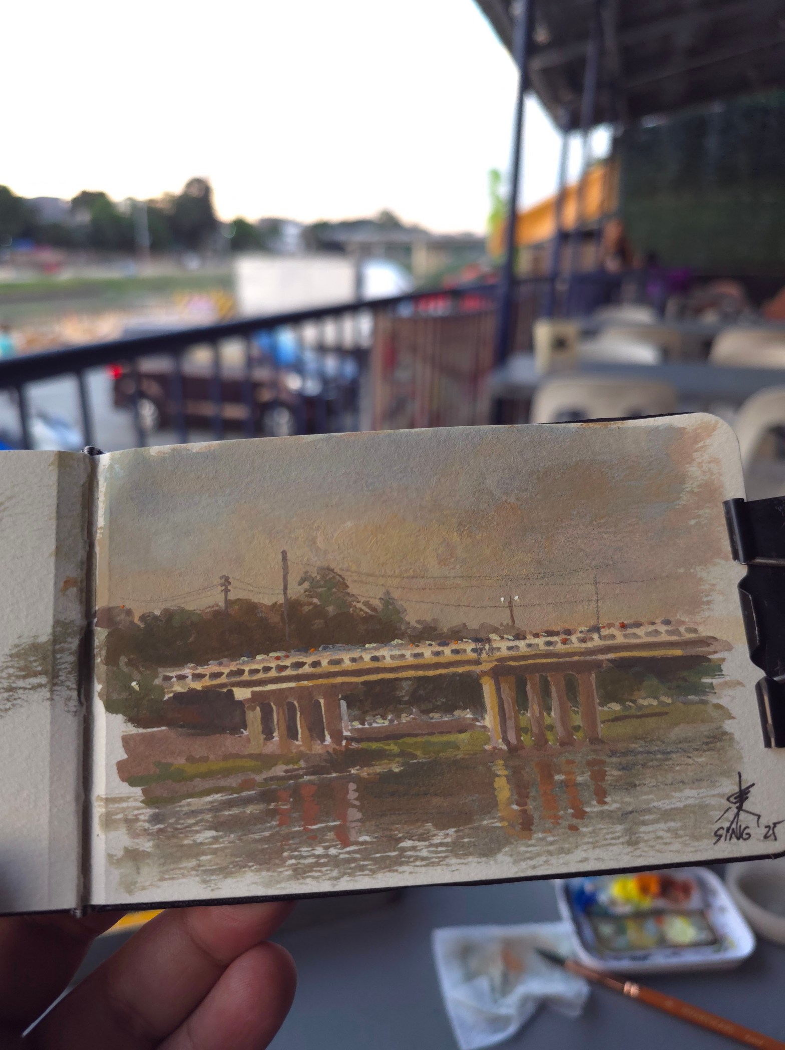
A quick casein painting of the Marikina Bridge during sunset. I did this after a group plein air session in the morning. The location’s pretty far from where I live, I thought I should make the most out of it.
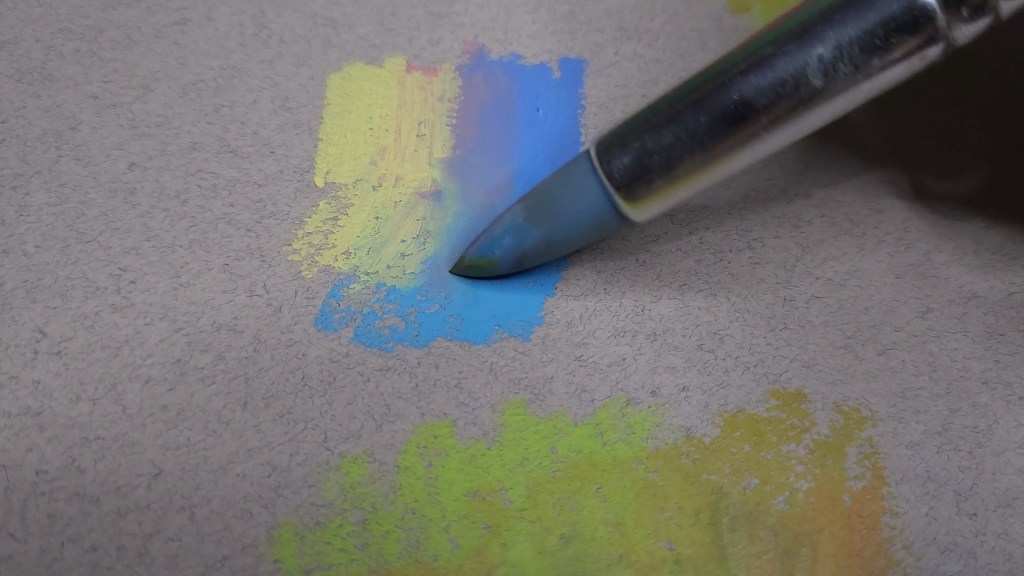
In 2021, I wrote a blog post about oil pastels. I have come to realize how potent this medium can be, as I have used it to create multiple portraits, still life, and even a contest entry that earned me my first award in a national competition. With proper technique, good oil pastels can be used to create effects similar to that of oils, like impasto and similarly expressive strokes. I even find it more convenient to use oil pastels as there is no need for large palettes, multiple brushes, and different mediums that emit harmful vapors. I just use a color shaper to blend as needed.
In the past two years, a lot of things happened. I have updated my oil pastel arsenal as new makers have entered the market. What’s cool is that some are a lot more inexpensive despite the quality being top-notch. This is quite helpful, considering the rising prices of art materials and the scarcity of some brands as some manufacturers’ production have been affected by the pandemic.
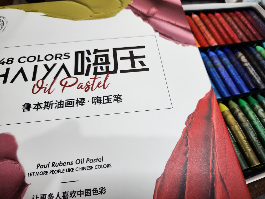
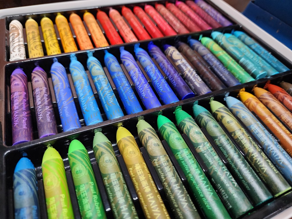
One of the new brands I came across is Paul Rubens, which recently launched a new line of oil pastels for artists of different skill levels. The China-based company has been making quality materials for some time. I have seen their extra soft pastel set and they seemed really good. I was able to get their 48-color Artist Oil Pastels set through AliExpress. It arrived quickly (I am from the Philippines) and in excellent condition. Here are my thoughts about their product.
Packaging. The oil pastels came in a thick cardboard box with an awesome design. At the bottom of the box is the lightfastness information, which is very helpful and quite rare, especially among inexpensive sets. Each pastel stick has its own slot in the molded plastic enclosure, thus keeping them all clean. The sticks are arranged systematically according to hue. It is secured in place with a sheet of foam. It came with an information sheet as well. It contains info about the available sets and colors, the manufacturer’s description of the product, and some suggested techniques for use. In terms of safety information, there is a choking hazard warning for children below three years old and what seemed to be some sort of regulation pertaining to heavy metals (as translated by an AI camera app). Many artist grade materials use pigments that contain heavy metals like cadmium and cobalt.
The box coverThe underside of the box with the colors, including opacity and lightfastness information.
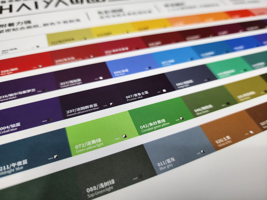
Color range. The 48 color set seems to be ideal for landscapes and floral paintings. The set has a great assortment of reds, blues, violets, and greens. Out of the 48 colors, only two do not have excellent lightfastness, but are still good (**). I honestly think that the hues included are not quite usual, as there are some that can often only be found in large sets in other brands, like green yellow light, light indigo, and prussian blue. There is a limited range of earth tones, however. There also seems to be no flesh color in the set and painting portraits could be a challenge as there will be a lot of blending or adjustments to the color temperature of the subject involved. I often mix colors while painting, hence I can work around the hues included in the set. Upon checking the leaflet, the flesh tones are in their 72 color set (the full range). I personally would like to buy it in the future.
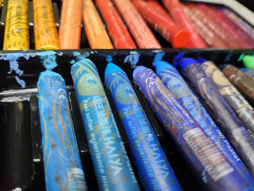
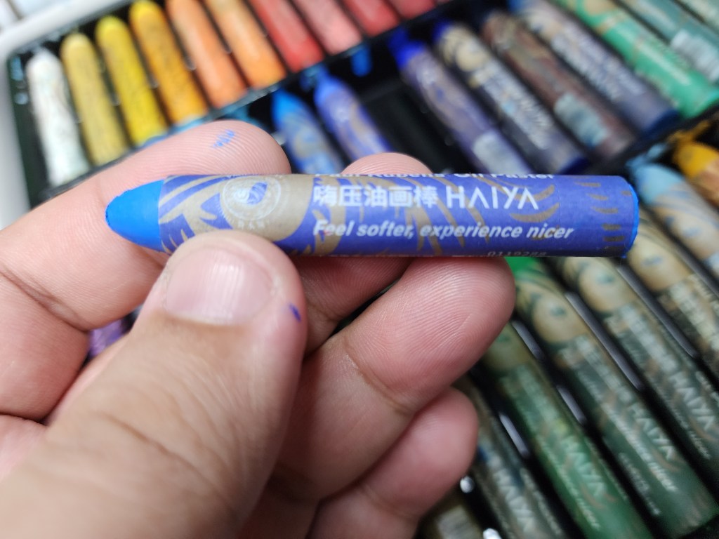
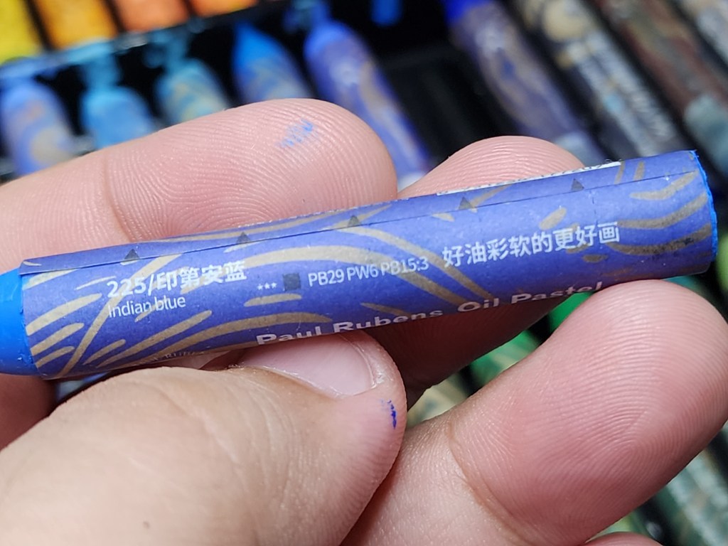
The oil pastel sticks. The sticks measure around 2.75 inches long and about a quarter of an inch in diameter. They seem quite large, especially when compared to other brands Each has a well-designed label that seems easy to peel when necessary. The labels contain the brand and color, but what amazes me is that the opacity, lightfastness information, and pigments used are also indicated there. Through this I found out that the set’s cobalt violet light and red deep actually use cobalt (PV15) and cadmium (PR108) pigments, thus explaining the notice about the use of heavy metals in the package. There are some Chinese texts that I could not read myself which (thanks to Bixby vision) turned out to be translations of the pigment information, as well as the company name and contact details. The tip of the sticks are pointed, akin to a bullet, which is great for covering large areas when held diagonally and fine details when the tip is used. This shape also seems to omit the need to peel the labels early to cover large areas.
The sticks are bigger than most brandsThe opacity, pigment, and lightfastness information are in the label of each stick.
The sticks are so creamy and pigmented, of artist quality indeed. I often use a color shaper in blending, and usually in inexpensive oil pastels the pigments would clump together due to the pigments and binder used, hence I often use expensive brands as they do not have the problem. The Paul Rubens oil pastels are just as good, they actually feel more like lipstick or butter. I tried doing a few swatches and saw that the pigments adhere to the support well (I often use pastel paper) and they blend really well and layering can be done quite easily, too.
Colors can be mixed with the color shaper. This allowed me to extend the range of the original 48 colors.Layering was easy. Each stick felt like butter.
I was so impressed that I immediately tried making a small landscape painting using the set that I have and the experience was really pleasant, it was as if I was using my oil pastels that cost a lot more. In the box and labels of each stick, it says “feel softer, experience nicer,” and their sticks can really deliver. I left the painting halfway through for about a day to see if the pigments would settle and allow for more layers to be applied. The pigments indeed settled, and more layers can be added without messing up the previous layers. If ever there is a need to reactivate the previous layers, it can always be done easily with the color shaper. I suppose using turpentine or mineral spirits for underpainting will work too. The sticks would work will with oil paints. It is also possible to create impasto effects by adding more pressure, or using a palette knife.
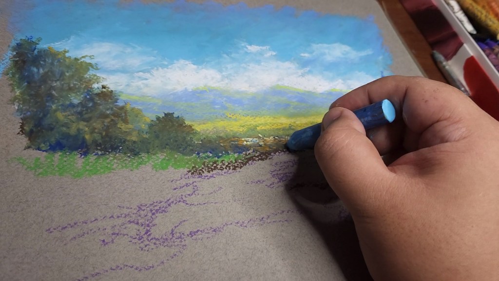
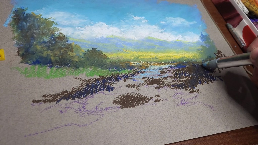
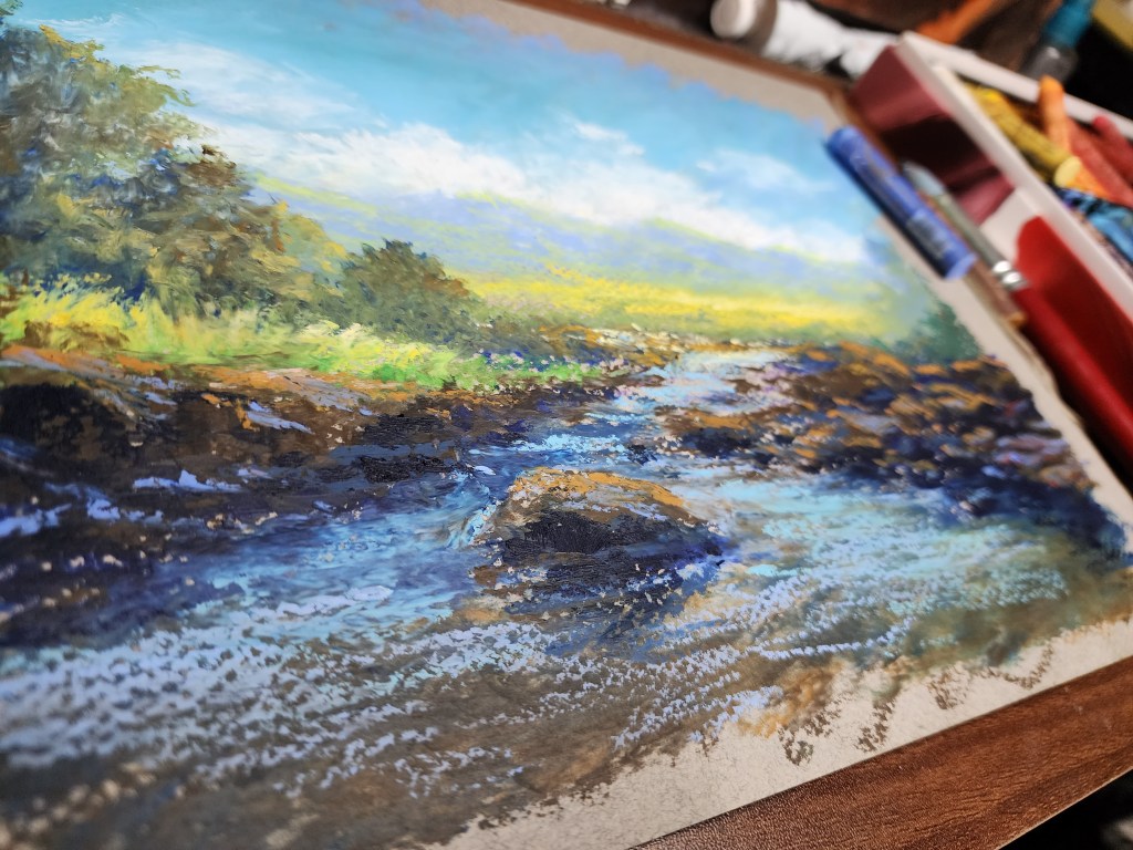
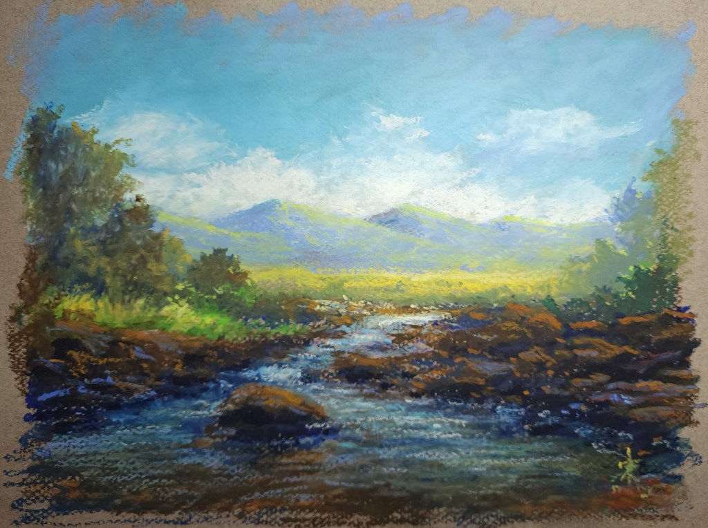
A landscape painting inspired by my Cool Waters series, made using the 48 color set of Paul Rubens oil pastels. I used a 9 x 12 sheet of gray pastel paper. I chose the rough side to see the covering strength of the oil pastels. I had no problems in using it, as layering, blending, and even color mixing felt easy to do.
I am personally impressed with the product, that I highly recommend it to artists of all skill or experience levels, though it seems quite clear that the set was made for professional artists. The Paul Rubens Artist Oil Pastels seem just as good as the more expensive and popular brands; even more economical. Using Bixby vision’s real-time translation, I was able to learn from the leaflet that the brand was established to offer as solution for artists who suffered from the high prices and unavailability of imported art materials. In 2010, the president of the Chinese Painting Academy encouraged the company that would become Paul Rubens to establish the brand. They consulted with artists and experts from as far as Germany, Belgium, and the Netherlands to learn more about pigments and how to make quality art materials. The company has the mission to make top quality art materials avaialble to more people. With my experience with their oil pastels, I would say they are on the right track. I know a lot of artists who are really skilled, especially with oil pastels, but they could not afford the expensive brands that have been known to be at the top tier in terms of quality. The Paul Rubens Artist Oil Pastels solves the problem as they are just as good – lightfast, soft, and blendable at prices that would not break the bank.
the Paul Rubens logo (used with permission)The artist oil pastels, as shown online (used with permission)
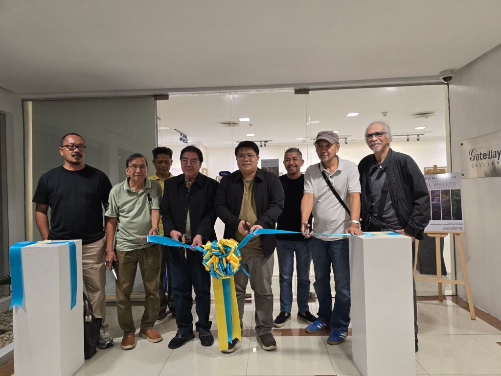
In October 2025 I finally had my first solo show at the Gateway Gallery. I sought advice from key people in the scene. Then I focused on my best-selling series. It has been my favorite for a long time. It was a tough ride, but was definitely worth it. My deepest thanks go to all who became part of it, especially those who supported me even from before.
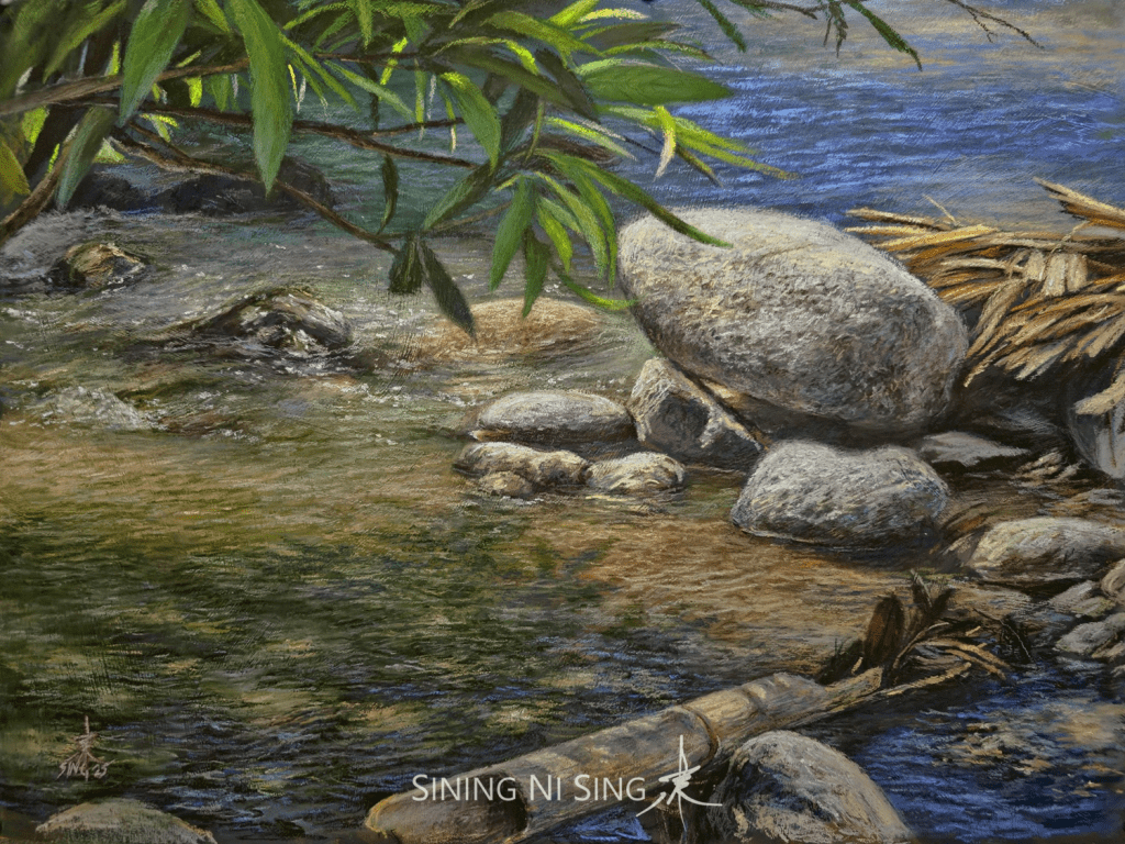
With the guests of honor (L-R): Mr Julius Legaspi, Mr. Edgar Santiago, Mr. Mario Panis, Mr. Carlos Cadid, Mr. Glenn Perez, Mr. Romeo Montes, and Mr. Dindo AngelesBalancing Act (Cool Waters 43) 15 × 20 inches pastel on board 2025 🔴
(the following text is from my show’s curatorial text)
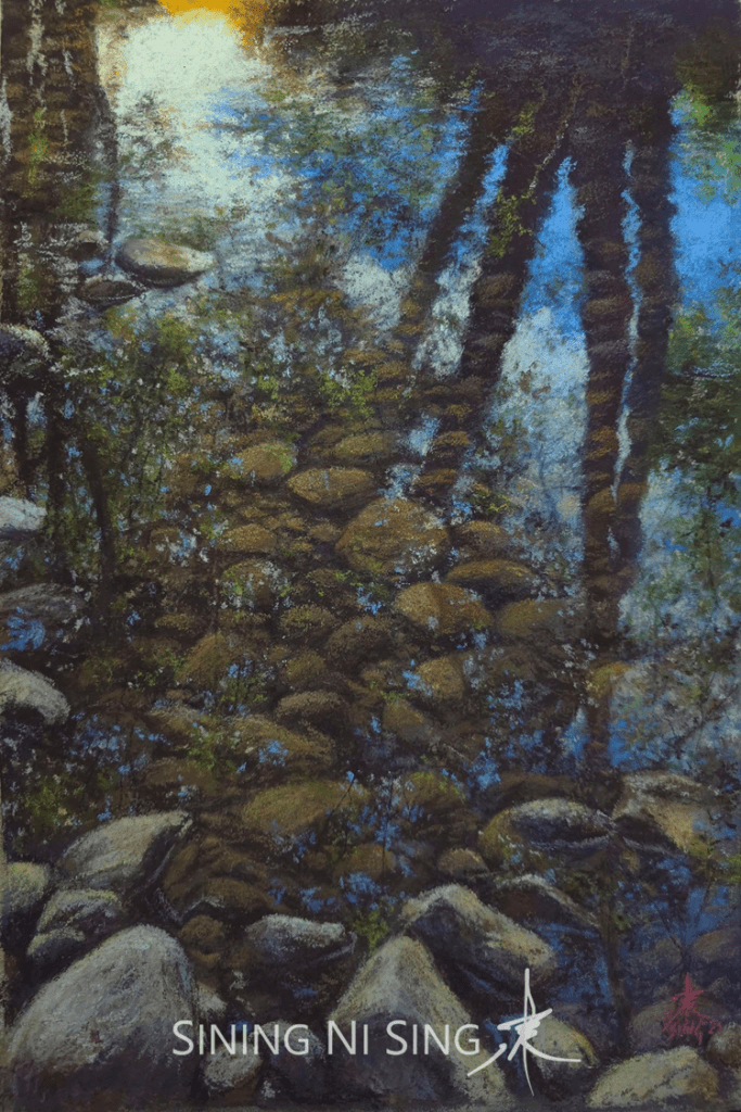
The Cool Waters series is rooted in the philosophy that art can and should act as a source of Contemplative Solace. For the artist, the recurring theme of the freshwater stream signifies a magical Escapism. Their professional life as an educator took place amid the demanding environment of Metro Manila. This series consciously rejects artistic provocation, dedicating itself instead to the singular mission of invoking peace, healing, and positive emotional refuge from the pressures of modern life.
This mission of emotional nourishment aligns with the core of Aestheticism—the value of “art for art’s sake”—but shifts its focus from pure sensation to pure tranquility. The goal is an experience of deep repose, a concept that echoes the contemplative value of art described by figures like Arthur Schopenhauer, who saw aesthetic experience as a temporary escape from the constant striving and suffering of the will.
Beyond its restorative purpose, the series is a ten-year journal of artistic discipline and growth. The paintings serve as a living record of the artist’s academic philosophy: a practice built upon the rigorous, sustained study of the Old Masters’ methods. With each painting, the artist actively integrates new knowledge, harnessing different mediums and techniques to demonstrate a commitment to the continuous evolution and mastery of craft.
The Cool Waters series ultimately reflects a deep-seated, threefold purpose: First, to pay reverence to the history of painting by diligently building upon the foundational techniques of admired masters and mentors; second, to deliver a clear message of positive emotional solace to every viewer; and third, to fulfill a personal commitment to the cultivation of ability akin to the Parable of the Talents.
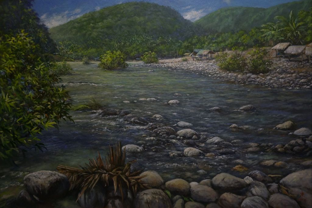
Agos River (Cool Waters 53) 24 × 36 inches oil on canvas 2025
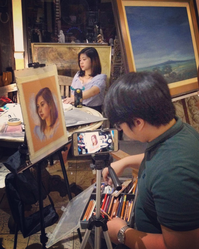
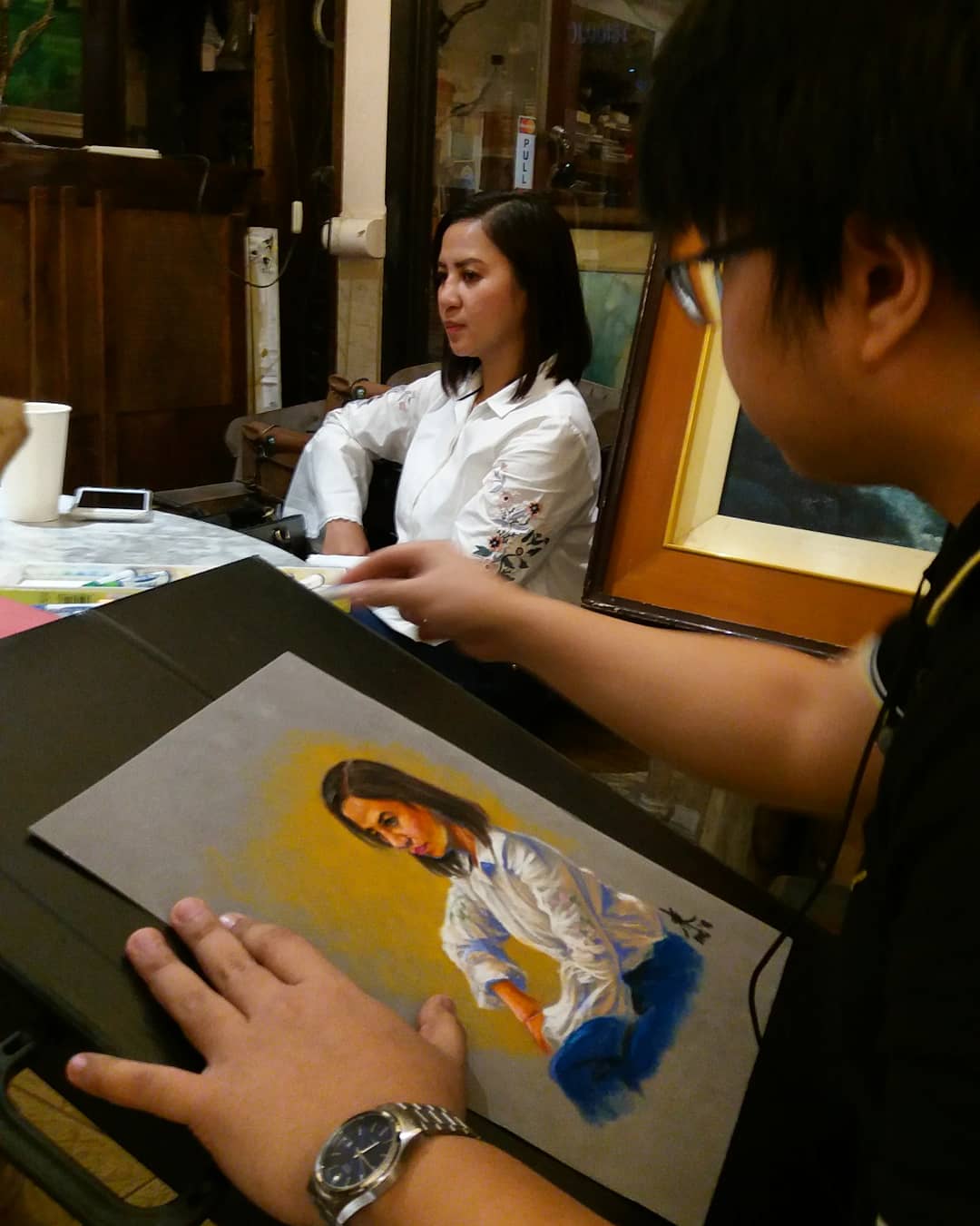
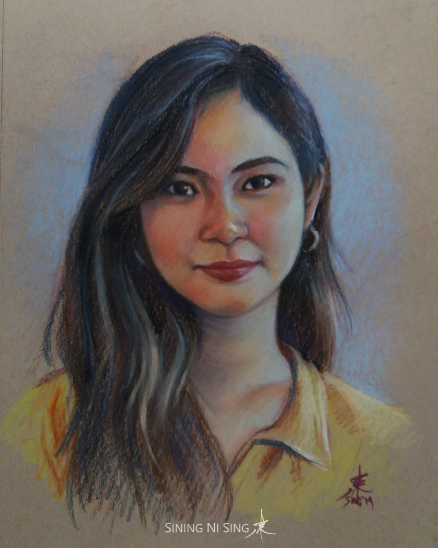
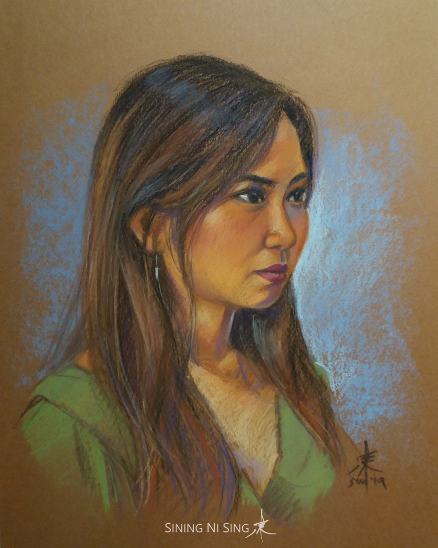
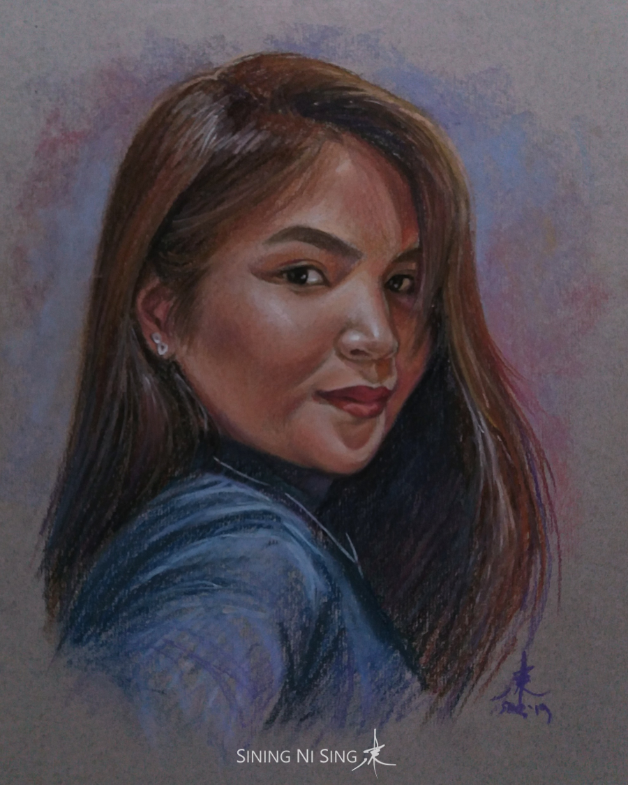
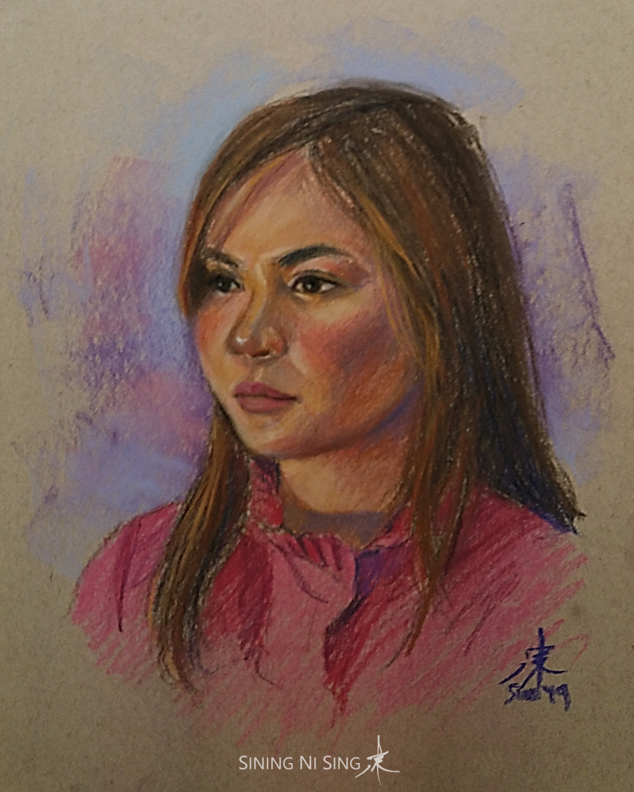
By creating one’s portrait, I do not just try to capture the subject’s likeness, to preserve the moment; I attempt to capture the subject’s soul, while adding a fragment of mine.
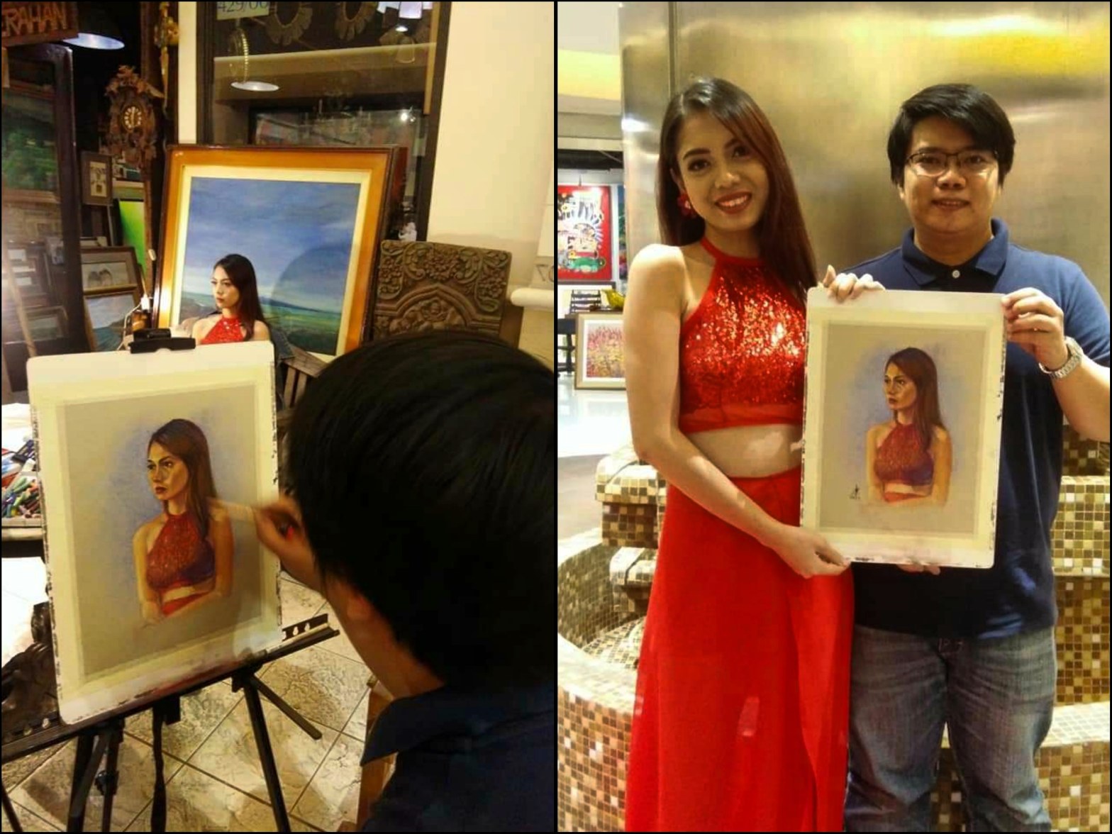
Photo taken years two ago in a 2Q Artists Philippines live portrait session in Shangri-la Plaza.
I have been creating portraits for quite some time. Each one is a unique experience. I could paint the same person, use the same materials, and even follow the same process; yet the results would still be different. This happens more in live portraits due to the greater amount of variables involved.
Photos from past live portrait sessions.
Live portraits on location are not easy to do, yet they are unparalleled in terms of learning opportunities and freshness. The pressures involved forces one to work at the highest level of skill, with fewer materials and settings that are far less conducive than the studio. The time is limited, too. In the studio, an artist can use different tools and methods to capture the subject’s likeness. On location, one needs to rely more on the ability to see, both literally and figuratively. As one of my mentors would often say, it literally puts one to the test, especially if the model / sitter moves around. The ability to make one’s studio and on-the-spot work consistent also serves as a testament of the artist’s skill, as many artists who can make astonishing studio portraits lack the ability to do live portraits.
Studio (left) vs. Live (right). Studio portraits may look more refined due to the seemingly unlimited time, techniques, and materials available. Live portraits on the other hand are spontaneous and focus more on the sitter’s impression or character.
As much as painting from a photograph in the studio may seem more convenient, I prefer painting from life or on location a lot more. I love the thrill of capturing the person’s character given the conditions mentioned above. It also helps me prevent overdoing the artwork, as I often unconsciously do especially in the studio. As Mr. Davy Lim of the Place du Tertre artists says, one needs to keep it fast and fresh. Capturing the exact likeness can be challenging though, as there is very little time to get all the measurements right, especially if the sitter moves around a lot. The least I could do is to capture the sitter’s impression or character. The spontaneity of the artwork however sets it above the usual studio portrait. Painting from life also seems to allow me capture the sitter better than relying from a two-dimensional image.
As one who does not have an art degree, I was able to acquire my live portrait skills primarily from my mentors and colleagues in 2Q Artists Philippines: Mr. Romeo Montes, Mr. Jeffrey Consumo, Mr. Abelardo Lovendino, and my good friend Froilan Galpo. We did dozens of live portrait sessions together when the group was still active. I also learned a great deal from the pillars of Philippine Pastel Artists Inc., Mr. Alvin Montano and Mr. Julius Legaspi, as well as the group’s demos and workshops that featured notable artists. Among my biggest influence and inspiration are the artists of Place Du Tertre artists square: Mr. Davy Lim, Ms. Agnes Fabricius, Mr. Svay Teng Denis, among others. Mr. Lim was fond of uploading their videos on YouTube and I had the chance to get in touch with him via Facebook. Recently I have acquired a copy of Andrew Loomis’ Figure Drawing for All It’s Worth, and I am still studying his methods.
Taken two years ago during a live portrait session sponsored by the Old Manila Eco Market in Shangri-la Plaza. Video by Mr. Francis Usero.
As for my favorite live portrait medium, I always prefer using pastels and pastel pencils. My rig was inspired by the materials used by the Place du Tertre artists. Most of my earlier training involved using oil pastel on felt. I have yet to try other mediums on live portraits.
My journey to refine my live portrait skills continues. My dream is to become part of the pemiere portrait societies in the country, or even the Place du Tertre artists in the future. My dream seems farfetched, but it gives me a sense of direction and intense motivation. The COVID-19 pandemic and the inactivity and eventual disbandment of the 2Q Artists Philippines really hampered my efforts. I practice in the studio but copying from a photo, even when trying to keep it fast and fresh just could not create the same experience. It’s not just the challenge and sense of accomplishment that makes it fun, but the opportunity to meet more people, the smile on the sitter’s face upon seeing the finished work, and the quality time spent with my fellow artists and mentors that make everything worth it.
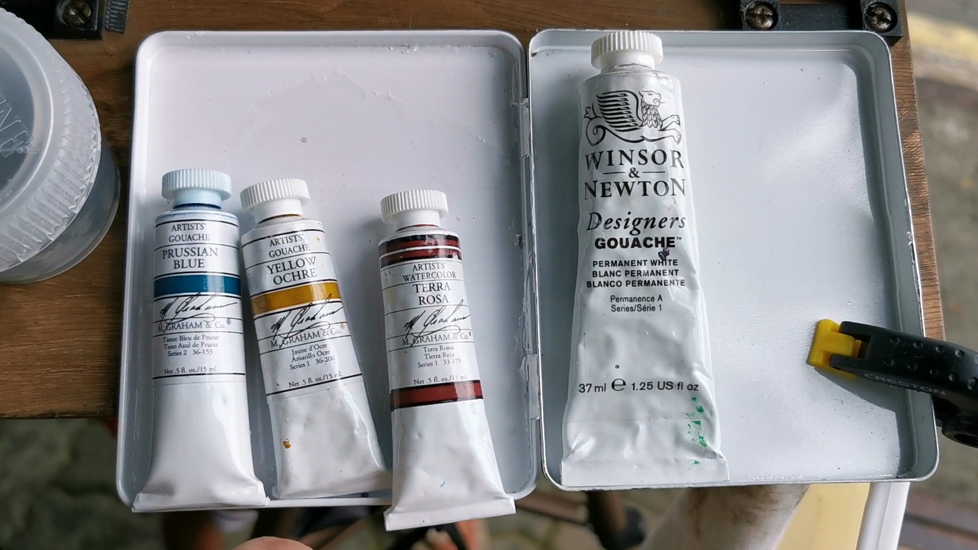
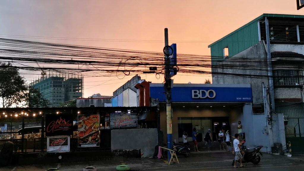
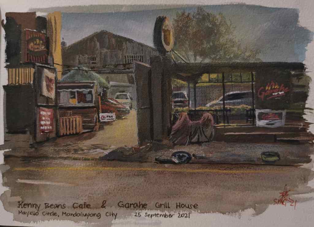
I went out to paint a nearby coffee shop and restaurant using gouache. I used the iron triad (terra rosa, prussian blue, yellow ochre, and titanium white).
The Iron Triad. As James Gurney explained, these colors were made using iron-based pigments.My painting setup. Totally inspired by James Gurney. I was finally able to buy the same exact 2 oz. Nalgene cup that he has and use neodymium magnets embedded on the easel’s surface to hold the metal palette in place.
While painting, a child approached me and asked if he could watch me work. He said was waiting for his father, who happened to be working in the parking lot of a nearby Korean restaurant. He was a smart kid, full of energy, yet very kind and polite. He had survived a lot of hardships in life. Chatting with him was eye-opening, really. (I would not post his photo to protect his privacy)
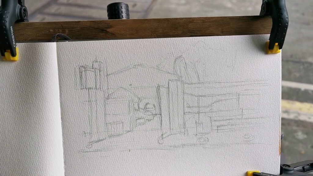
The initial sketch I made using a graphite pencil.
After about an hour it started to rain. The majestic tree beside us and my umbrella kept me and my lively companion dry.
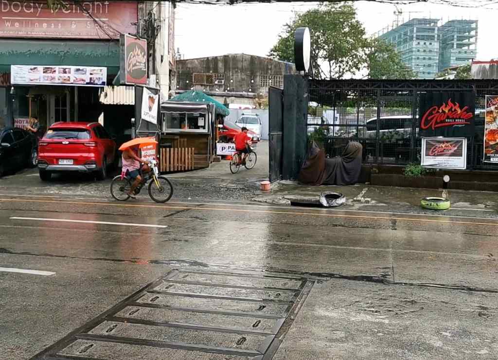
My subject. I started with an overcast sky then the weather went nuts.
The sun came out shortly. This time the umbrella could not protect me. It scorched my legs, feet, and right arm. A small price to pay for awfully good painting spot.
Many people dropped by to look at my work. Among them was a fine young lady from across the street. She introduced herself as the owner of the coffee shop I was painting. She seemed really nice, and even invited me to come to her shop after I finish painting. She stayed there with us for a while, under the blazing sun, and said she would tag me on her post.
She came back again after a while. I noticed that a lot of people came to ask her for a photo op. It turned out that she was a well-known vlogger! I was stunned.
Ms. Seah (Instagram: @chelseah.hilary) and the young kid. I did not know how immensely popular she and her siblings were online, and that the coffee shop was her business.
Soon the sun started to set, casting a beautiful warm glow. Then it started to rain again. This time it poured harder, though it didn’t last long. It was getting dark too, so I rushed to finish the painting. I used dry pastels to recreate the warm glow earlier from my memory.
Time to pack up. The lights in the coffee shop and restaurant seemed lovely, that I might consider painting it at night.I used a combination of white and yellow dry pastels from Caran d’Ache and Faber Castell (Polychromos line).
It was almost six when I finished the painting. I went to Ms. Seah’s shop, showed her the painting and bought an iced drink. The people there were really nice, especially Ms. Seah who even gave the kid some drinks for him and his father.
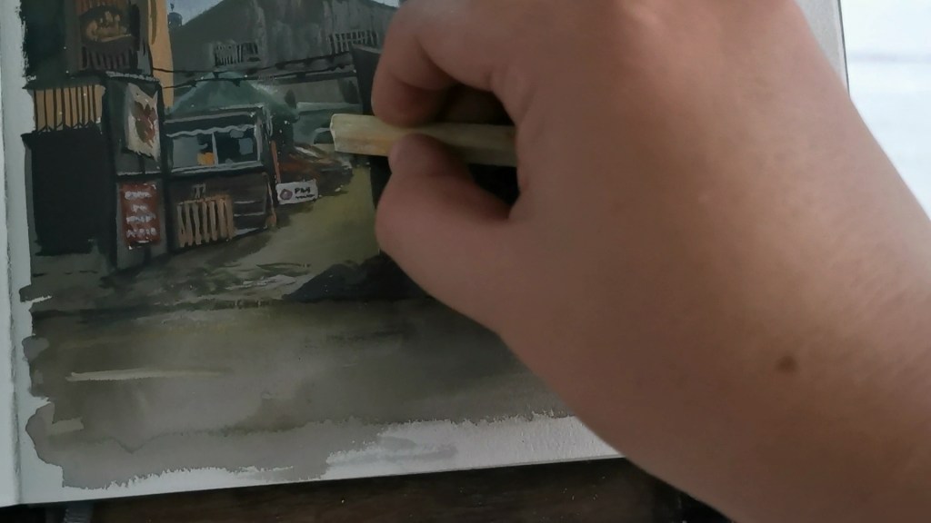
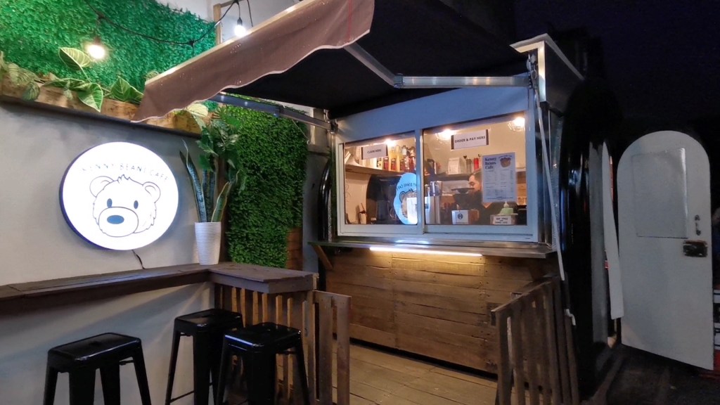
The finished painting. I added a few more textures using water-soluble pencils (Caran d’Ache Supracolor).Kenny Beans Cafe, the shop owned by Ms. Seah. I highly recommend it. I love the taste and the price is just right. She was working there hands-on, too! Will definitely go back for more. Check out their Instagram: @kennybeanscafe
The kid happily went back to his father. I glanced at the shop again and went home.
I only went out to paint, in attempt to heal myself from a week’s amount of stress. I ended up meeting really nice people from our area. Thank you, Father for this Saturday. Will definitely go back there to hang out and meet my young friend again.
Update: Ms. Seah and her sister Niana Guerrero (a popular dancer and content creator) shared the image of the artwork I posted on Instagram, thus causing it to gain more than 1,000 likes and my followers nearly doubled. Thank you, Ms. Seah and Ms. Niana, as well as all those who liked my post and followed my profile.
I tried to paint the view from our doorstep (we are in the third floor of an apartment). I was planning to paint a car too, but I need to stay at home for a few days.
The view from our doorstep.
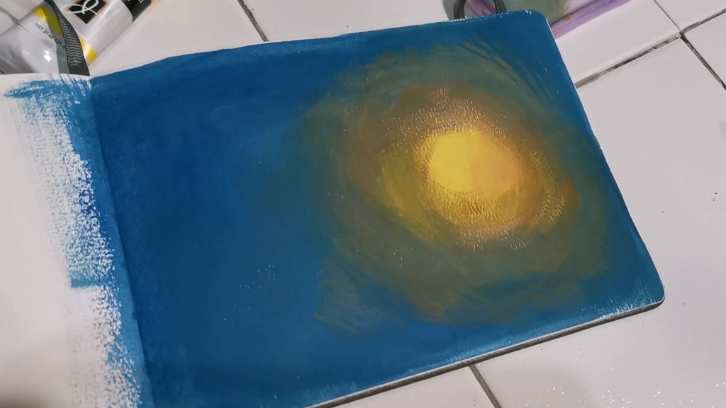
I used an underpainting similar to the one Mr. Gurney made for the spotlight effect video. I made the underpainting using casein (titanium white, raw sienna, naples yellow, permasol blue).
The casein spotlight underpainting
I painted the scene using a combination of watercolor and gouache. I used terra rosa, anthraquinone blue, cadmium yellow, and titanium white. I also used a bit of yellow and white soft pastel in the end to enhance the glow. Though there were other light sources in the scene, I focused the light only on one spot to match the underpainting.
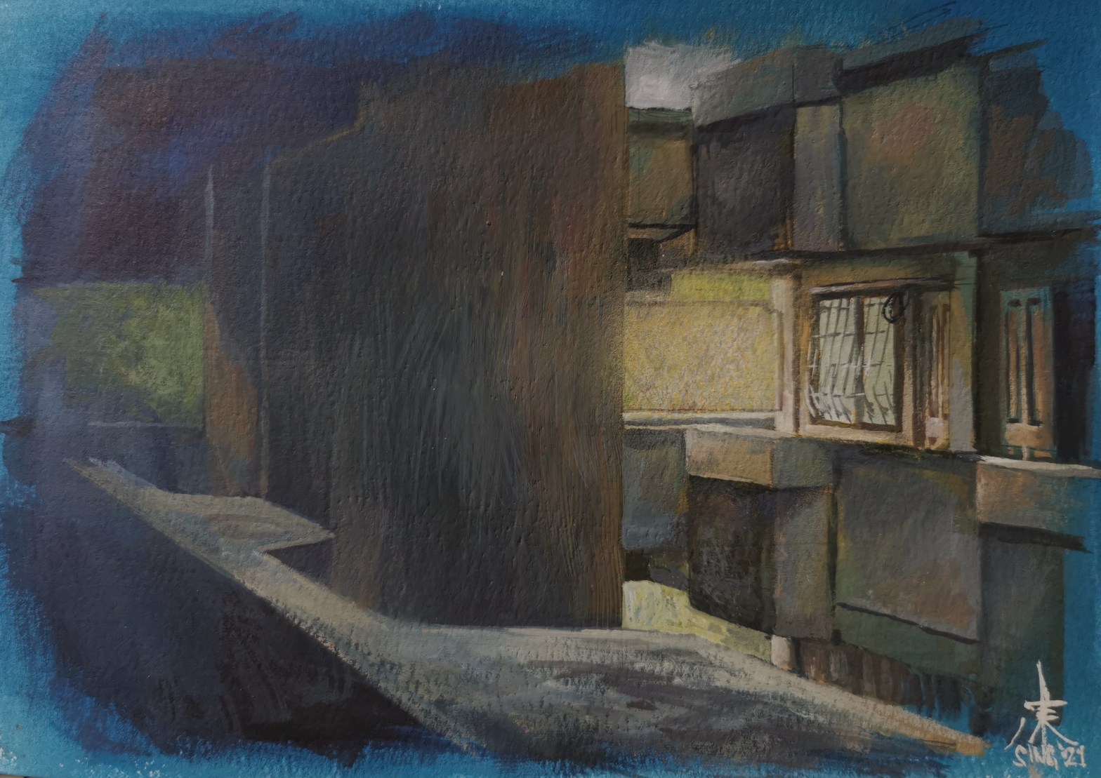
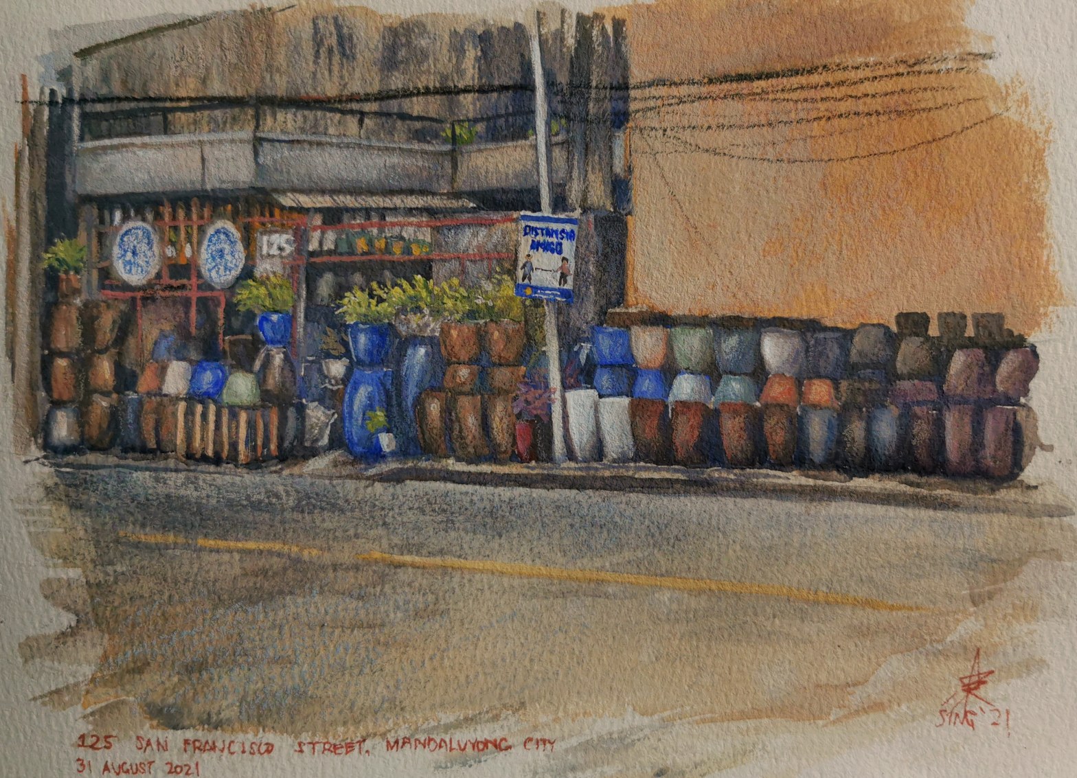
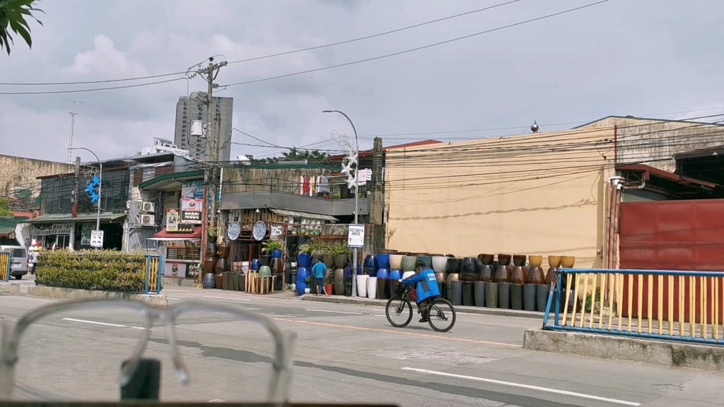
Last August 30, I tried to paint the pottery shop just outside the apartment complex where I live. I always found it as an interesting subject but the task just seems too daunting due to all the detail. I was inspired by Mr. James Gurney’s county fair video to finally give it a try.
The pottery shop I painted.
I decided to use gouache as I wanted to practice using transparent and opaque layers too. I used the triad of burnt sienna, ultramarine deep, and permanent yellow deep and titanium white. Near the end of the painting, I used a bit of carmine for the lone red pot and the iron bars.
The colors I used.
Again, the rain fell while I was painting. This time it was heavy. I felt somewhat used to it but still it caused me to slow down as the paint seemed to dry slower. I had to hold the umbrella on one hand, limiting my mobility. I also paused a couple of times to take a few clips and still photos. When it stopped I barely had enough time to finish the painting. There were still a number of details missing and I wanted to stick to the lighting earlier, so I opted to finish it at home. Mr. Gurney’s plein air painting setup was so convenient and portable that I did not have to pack up anything – I just carried the tripod as it was to my room.
I worked on the painting again for another 45 minutes, mostly on textures using water-soluble colored pencils and crayons and the remaining fine detail using a small round brush. The entire process took about six hours.
The finished painting. The date should have been August 30 instead of 31.
I examined why I was not able to finish the panting faster. Here’s what I came up with, including other observations:
My color mixes were often inadequate thus I spent a lot of time mixing the same color. It also prevented me from laying in colors efficiently, as many parts of the painting actually had the same color and I could have worked on them all at once if I had enough.
I ran out of paint a couple of times. Getting the tubes from the bag and squeezing out more paint not only took some time, but also somehow ruined my momentum. I need to be more familiar with the strength of the colors I use so I can squeeze out the right quantities before starting, instead of just having the nearly the same amount of color on my palette. In this session, I ran out of ultramarine deep thrice, titanium white once, and ended up with a lot of leftover burnt sienna (it’s really strong).
Taking clips and photos by hand while painting decreased my efficiency, focus, and momentum.
I tried to capture too much detail, down to the exact number and placement of pots in the scene. I could have saved some time by focusing only on a specific area and leaving the rest subdued.
I need to improve my home / studio practice exercises and routines. Perhaps doing more swatches and color tests, washes (especially for transparent and opaque applications), setting time limits and simulating conditions on location may help. Skills and familiarity of the medium take time to build up, and efficient practice routines can probably help accelerate the process.
I need to improve my planning, especially if I already knew what the subject / location would be. For this painting, I only thought about the colors and the challenge of painting a lot of detail. I could have studied it in advance using Google Earth Street View and identified potential objects of interest and difficulty. I also should have tried practicing how to paint some specific objects in the scene, like the pots. Doing this, however, might reduce the spontaneity of the painting, or the feeling and satisfaction of encountering things first hand and overcoming challenges on location.
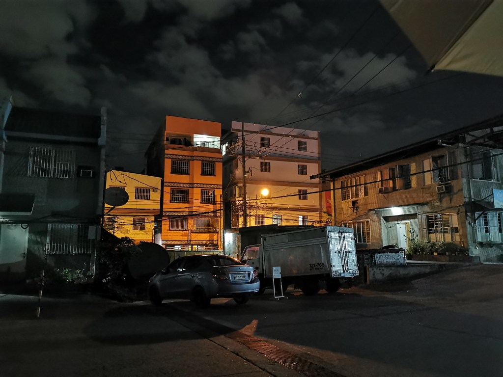
Some plein air studies are only possible at night.
The streetlight that I painted. The building behind it was actually light blue in color.
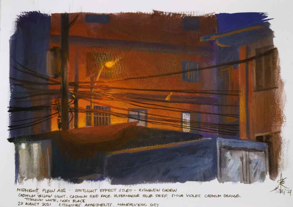
Around midnight I went out and tried to paint the streetlight visible from within our apartment complex. I used casein, specifically the following colors: cadmium yellow light, cadmium orange, cadmium red pale, shiva violet, ultramarine blue deep and titanium white. I had some trouble mixing a good dark tone, so I added a bit of ivory black. For the glow effect, I used water soluble wax pastels (Neocolor 2). I tried to replicate the colors in the actual scene and focused on the effect of the light to the cables in front of it. James Gurney’s tips on painting a lens flare effect really helped.
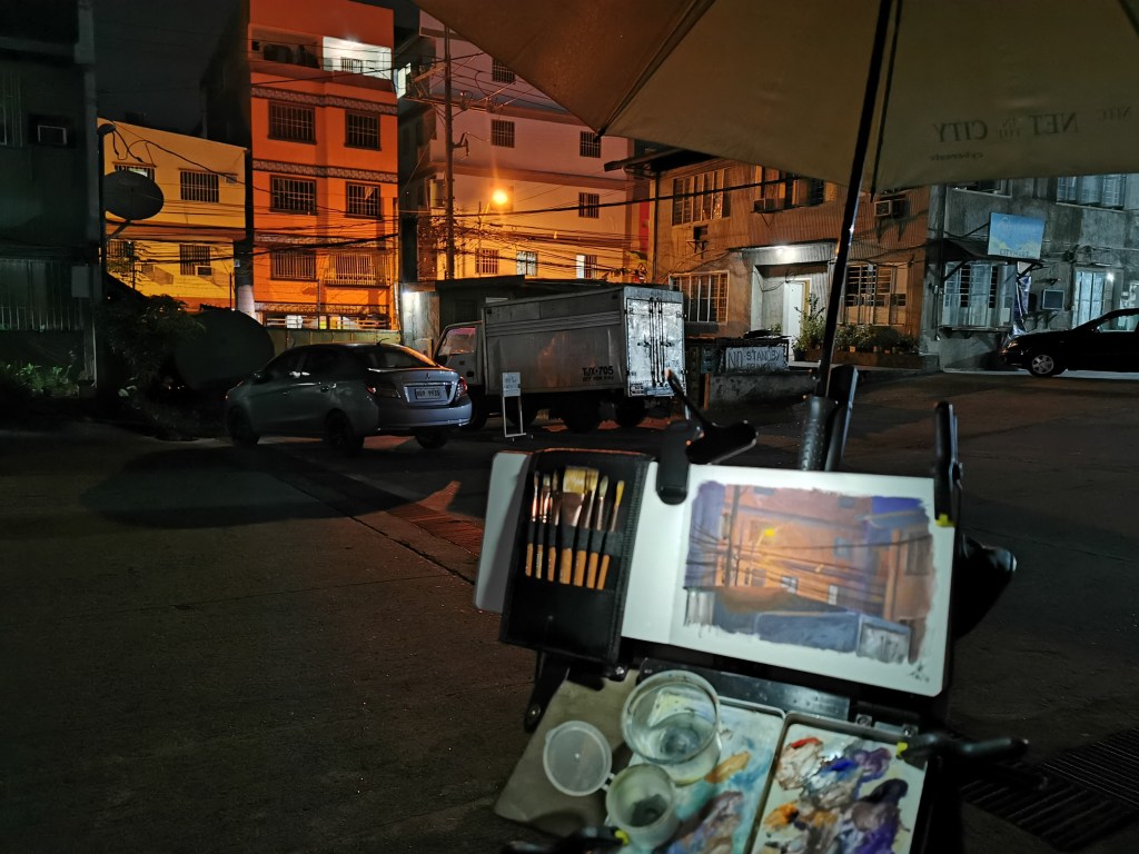
My working area was dark and I had to rely on a rechargeable LED clip light. I noticed that my color mixes seemed darker than they should, perhaps due to the effect of the clip light. Looking back and forth between the warm streetlight and brightly-lit sketchbook also messed up my vision.
The clip light’s brightness also started to decrease after an hour. I did not bring a powerbank, so I had to work faster, adjusting the distance of the LEDs from the sketchbook to compensate for the decreasing brightness.
My working area.
I added some cool colors in the foreground to complement the warm, reddish area at the back.
The entire process took about two hours. I documented the process and uploaded it on YouTube (https://youtu.be/0c-AMe3DFqM). Here is the final painting:
Recently I have been using casein as my main painting medium for plein air, as I have learned about it from James Gurney’s YouTube and Gumroad videos. It was fairly new to me and I quickly fell in love with it. Getting to use the classic medium was such as an accomplishment for me, as I had always wanted to try new mediums.
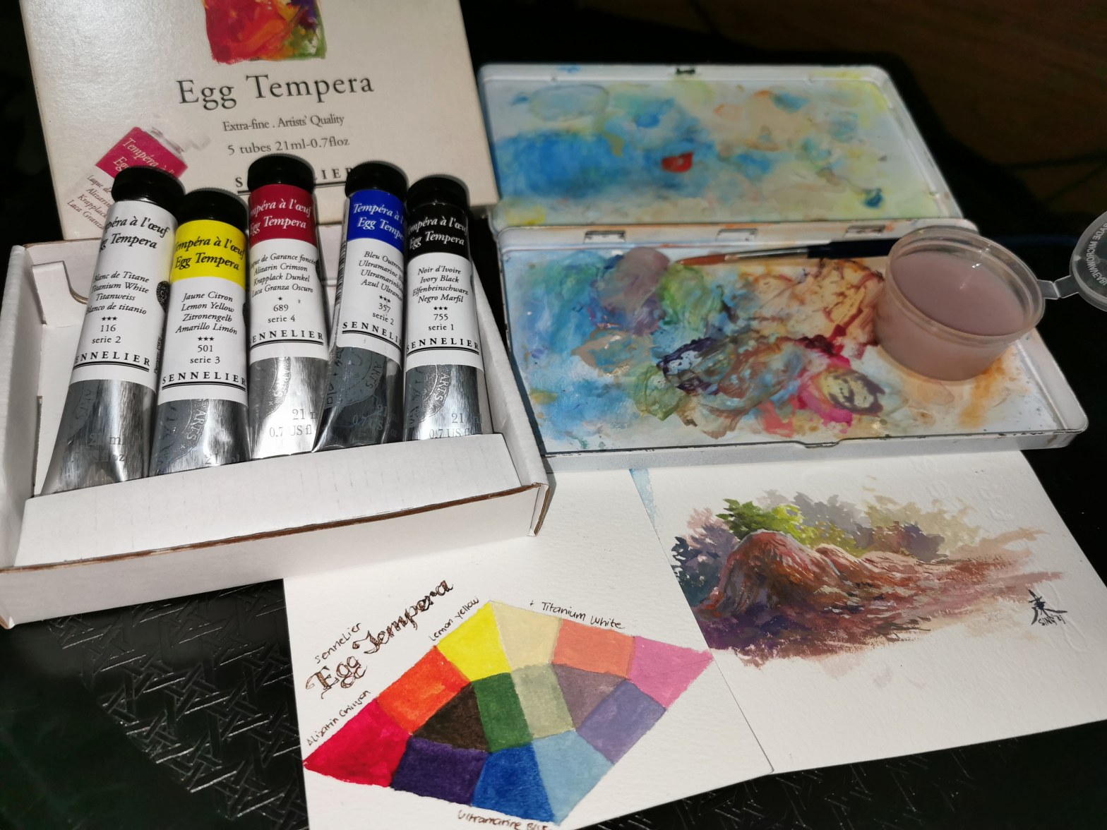
However, upon reviewing the list of mediums that I have tried, some still seem to be missing and among them was egg tempera.
I have read a lot about it before, especially for the college art appreciation classes I taught. The medium seems to be quite intimidating, as it is reportedly extremely hard to prepare and use. I know that it goes beyond the usual egg yolk plus pigment formula as most books say. Its quick drying nature and the use of egg yolks somehow prevents me from trying it.
One day I was browsing the inventory of a local art supply store (Art Nebula) when I came across a set of Sennelier Egg Tempera. A golden opportunity to try the medium had arrived, and I simply could not let it go. Before I knew it, I had purchased the item and it was now in front of me. Yes, the delivery was really quick!
The set has three primary colors (alizarin crimson, lemon yellow, ultramarine blue) and black and white. I tried to make a triad test and got amazing results. It really seemed transparent but the colors are so rich and color shift seemed minimal after it dried. I used the leftover paint from the palette to paint a happy little rock.
And yes, the paint really smells like eggs, albeit a bit sweet. More like cookies!
The triad test and the happy little rock I painted on 4R sheets of Arches cold pressed paper.
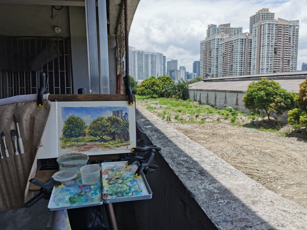
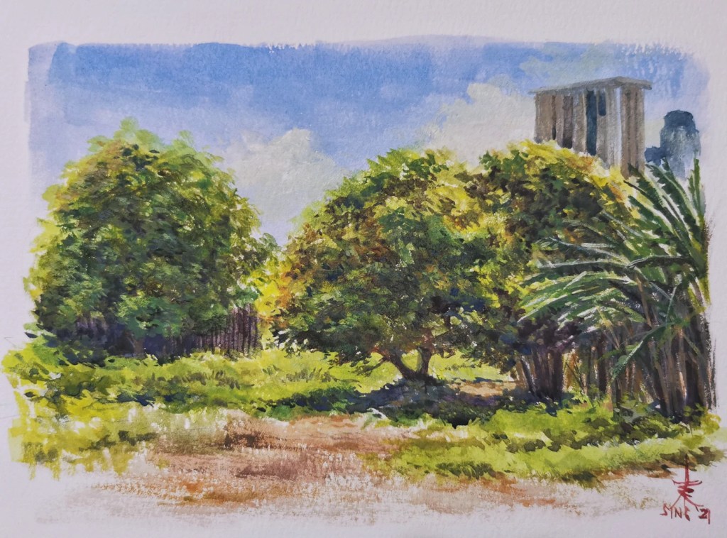
One Sunday morning, I decided to take it out for a spin. I decided to paint a nearby grassy area with trees visible from our apartment building.
Painting on location. I did not realize that my right arm was exposed to the sun until it seemed red and painful that night. The sketchbook and brushes (gouache set) were from Etchr Lab, also sold locally by Art Nebula.
I used the triad of alizarin crimson, ultramarine blue, and lemon yellow and titanium white.
I tried to experiment with transparent washes and opaque layers to learn how this medium works. It felt like gouache, but seems to be more translucent and vivid. I would not recommend very thick applications though, as it seemed to be prone to cracking and chipping off, much like casein. Using small overlappling strokes to create translucent layers, as other artists suggest, seemed to be the best way to use it. The paint also dried rapidly, even faster than casein.
Plein air trees Egg tempera on A5 sketchbook 2021
I love the brilliant colors. The vibrance seems reminiscent of varnished acrylic and oil paintings. I love how Sennelier created a portable version of this medium while reportedly staying true to how it was prepared in the old days. Preparing the paint on my own like the old masters did will truly be an entirely different experience, but the excellent, professional quality and portability just can’t be beat.
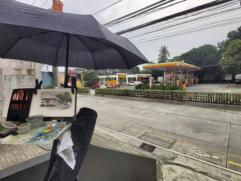
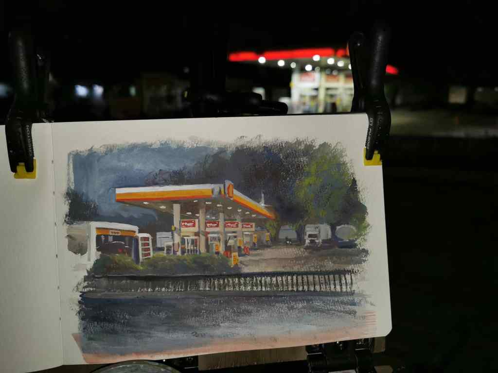
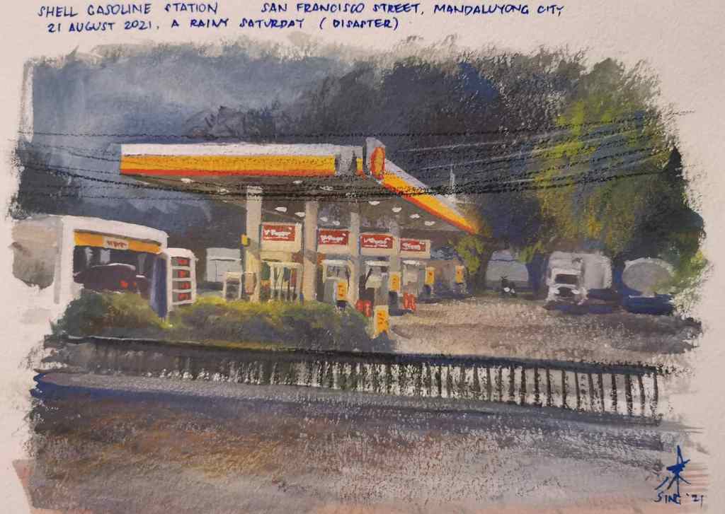
It was a Saturday with a gray, overcast sky and 50% chance of rain. I went out a few minutes before 2:00 PM, and tried to look for a subject in our neighborhood. A Shell gas station caught my attention. I knew painting it would be hard. Too many details, values seemed hard to figure out, plus the perspective. I took the risk and thought maybe I should give it a try.
I used casein (cadmium red pale, cadmium yellow light, ultramarine blue deep, and titanium white) on an A5 sketchbook. I started by sketching the subject with a water-soluble colored pencil. It took me a while to measure the objects and get the perspective correctly.
Just as I was about to block in the colors, it started to rain. Good thing I brought an umbrella and extra spring clamps. I was able to attach it to my tripod and both my hands were free again.
I used transparent washes first, as it really helped in getting the texture of the concrete. I used opaque colors as I tried to fill in the big shapes and details.
The spring clamps held my umbrella in place.
I was planning to finish it in two hours, but it seemed too difficult for me. Three hours after I started, I was only halfway through and it was getting dark. I did not have the luxury of coming back for another day. Then the station’s lights turned on. The values and the shadows changed dramatically. I thought it was pointless to continue, maybe I should just go home and copy from a reference photo I took earlier. My legs and feet were painful too.
That fateful moment. I almost threw in the towel at this point.
But I chose to continue and finish it on location.
I used my phone as a flashlight so I could see what I was doing. The rain started to fall again, but thankfully it was only light and quick. I worked on the painting for an another hour. I painted over the gray sky with dark blue and made the posts and pumps warmer to make them stand out. I painted the rails in the middle of the road as well as part of the pavement in the foreground using alternating opaque and transparent layers. I tried to add the power lines using a water-soluble colored pencil in the end. The pencils don’t work as well as they do in gouache and watercolor, so I used water-soluble wax pastels (Neocolor 2) instead. I also tried to use the spotlight effect in one of the pumps.
Almost done.
I finished the painting after five hours, at exactly 7:00 PM. It was not as I good as I wanted it to be, but I was quite happy that I was able to finish it. Good thing I persisted and chose not to quit. The casein’s properties also helped, as the painting did not look too dark.
The final painting
Shell Gas Station Casein on sketchbook 5 in. × 8 in. Painted on location 2021